The bubble graph is also my favourite - and have a couple of examples to illustrate its power.
Using the data from the BI Samples (available from OTN), I have used Discoverer to create a workbook that shows me how my product categories are doing - i.e. margins, sales, and change in margin over last year. And I want to see things in perspective - margins and changes in margin will be of greater interest for those products (or product categories) for my volume sellers.
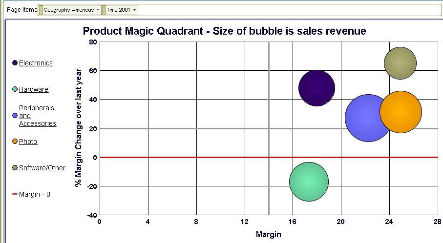
 I can either use this crosstab as the basis for analysis, or I can crete a bubble graph as shown below: the bubble graph is a graph subtype available under the 'Scatter/Bubble' graph type.
 Click 'OK' and your graph is plotted. Simple as that - takes all of five seconds, maybe a little longer if you get distracted looking at all the other fabulous graph types Discoverer offers.
Take a look below:
- On the X-axis I have margin (the first column in my crosstab)
- On the Y-axis I have the change in margin over last year (the second column in my crosstab)
- The size of the bubble is the sales revenue measure (the third column in my crosstab above)
 I should be a happy person here, reasonably speaking - most of my product categories are in the top-right quadrant, which means that not only are margins healthy, but they have also grown nicely over last year. But I do have one product category in the bottom-right quadrant - Hardware - that I may want to investigate to see if the problem can be isolated in a specific product sub-category.
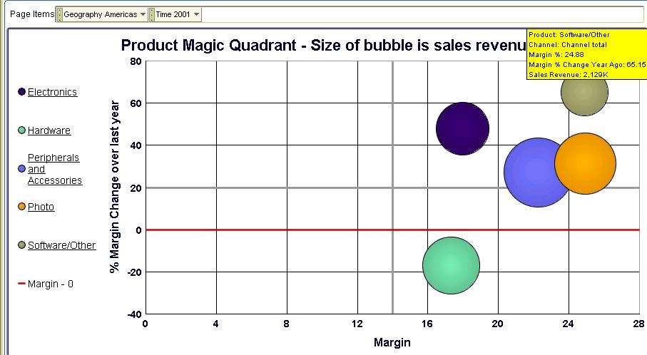
Or, I may want to analyze the 'Software/Others' product category (the top most bubble) further.
 If I double-click the 'Software/Other' bubble (or click its legend label on the left) I see that 'Recordable DVD Discs' are (unsurprisingly) doing good. But the rest are displaying only middling sort of performance - they are more in the left side of the box than the right. 'Recordable CDs' is in fact the laggard product sub-category here.
 Drilling down the 'Recordable CDs' sub-cat tells me that my 'Jewel cases pack of 10' sell the most in this sub-cat, and aren't doing too badly. Maybe I should focus on this item to make sure I can keep its margins shored up. Or maybe I need to cut out 'CD-R pack of 10' from my product-mix since they are showing falling margins, and are likely to prove to be a drag on my bottom line.
 Returning to my parent product sub-category of 'Software-Others' (by simply clicking the 'Recordable CDs' link in the legend, the one with the up-arrow).
Here I want to look at my 'star' - Recordable DVD Drives - a little more.
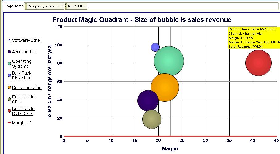 Yikes! Something is wrong here - while the single 'DVD-R Disc with jewel case' is a real hot seller, and with health margins too, every other product is actually giving me low single-digit margins. And two of those products are actually seeing shrinking margins. Time for action - I may want to drill to detail, to the transactional level, and see the individual sales transaction rows (and you can do that with Discoverer!).
 As you can see, a bubble graph goes a long way beyond the simple (and simplistic) bar graph types - sometimes you don't need to use fancy and overly complicated visualizations to get insight into your data. The tools and the means are all right there - at your fingertips. Analyzing three different measures in a single graph is not always easy, but the bubble graph is a particularly well-suited graph for the purpose.