Monday, October 25, 2010
Replay of eseminar - Visualizations in OBIEE 11g
An eseminar on visualizations in Oracle BI EE 11g that I did in September is now available on Oracle University (http://ilearning.oracle.com/) at eSeminarOracle BI EE 11g - Visualizations
Replay of spatial visualizations in OBIEE 11g
As I posted I did a webcast on spatial visualizations in Oracle BI EE 11g (Spatial Data Visualizations in OBIEE 11g). This eseminar is now available online at eSeminarOracle BI EE 11g - Spatial Visualizations - this may require a login and may not be available free for everyone.
Monday, October 11, 2010
Spatial Data Visualizations in OBIEE 11g
 I did a webcast last week on spatial data visualizations in Oracle BI EE 11g. This entire session was focused on mapping in the suite, and while I tried to split the time evenly between the front end and the back end parts of mapping, I realize that talking about and explaining how the magic actually happens requires more than 20 minutes or so.
The plan was to do a very quick introduction to maps in 11g, and then dive straight into demonstrations. I have followed this path frequently in the last - start off at the top, show the capabilities of the product in the Dashboards interface, as end-users would see it. In most deployments, your dashboarding product is seen by more than 90% of the users. Then move to Answers, the report creation and analysis interface. Often also known as the "power user interface", this is where analysts will often go to to perform deep analysis using the tools at their disposal. Answers is also the product that is used to create the analyses - tables, pivots, graphs, maps, gauges, etc... - that are published to a Dashboard page.
The point of starting out with a Dashboards demo is to show how easy to use the interface in maps is for end-users, and the great number of options available to them, from sliders on color ramps, to drilling, to invoking Actions, to sending master events to listening views, to checking on or off different formats displayed on a map, and more.
After this little bit of magic is shown to the user, the focus then shifts to Answers. Here the point is a little different, and yet much the same too. To show how easy it is to create reports with maps. That maps are really just another view in the product suite. A point-and-click interface is what drives the creation of maps. That it is possible to create maps in as little as 15 seconds. Or less.


Towards the end of the session, I had this neat little slide that I borrowed from one of David Lapp's excellent presentations, that I think captures very neatly the four main scenarios of mapping in an analytics environment.

Tuesday, September 28, 2010
Data Visualizations - Show Some Hide Some
The Search Engine Land site had a post on Jun 29 2009 - Google: We’re Not Really That Big But If We Are, We Aren’t Bad - where charts were used; specifically, charts that Google has used to argue that while it may appear to be a big company, it is not that big when compared to some of its peers, or in relation to the size of the market itself.
Here is the data table used below (from the site):

And two pie-charts:

Let's start with the Google pie chart, which tries to highlight the diminutiveness of Google's market share.
Data visualization experts have lamented the use of pie charts in visualizing data. I will not belabor the point. Instead, I believe the same data could have been displayed more effectively using either of the two charts below
The first one is a simple vertical bar chart, while the second one is a stacked percentage vertical-bar chart. Since we are working with percentages, either chart is conveying the same information.
The data in question for Google is called out by the use of a different color, and the size of the data is made clear by the height of the 'Offline' bar. Even in comparison to the 'Other Offline' bar, the Google bar's size pales in comparison.
Adding a data label may seem redundant, but if the chart does not support hover tooltips, then adding the label, with the precise value of the series, helps.
 OR
OR
http://www.businessinsider.com/chart-of-the-day-google-is-not-that-big-after-all-2009-7 mentions the post, and has an accompanying chart:
 Here the attempt is to compare each company on two variables - revenue and employees. A dual-Y-axis bar as the one used above is not good, not good at all, for such a presentation of data. What exactly is the point of plotting revenue and employees as bars in this graph?A line-bar maybe, but even that is sub-optimal IMO.
If you have to do this type of a comparison, the scatter plot is most effective since it allows for a meaningful comparison across companies too. To make this interesting, you could also add a third variable, and plot the data as a bubble chart. You could also use a butterfly graph.
When displayed as a vertical bar, what is obvious is that Google has much lower revenue, and even fewer employees when compared to any of the companies it is being compared with. Fair enough. But what the chart does display, but not tell you very clearly, is something very interesting, that I explain with charts below.
Take revenue and employees, the two measures in the chart above. To perform a meaningful comparison, it is first necessary to normalize these values first. One way is by using ratios instead. i.e., the ratio of the company's revenue to the number of employees. Divide the revenue by the employees, plot **that** data instead, and this is what you get:

Innaresting, wouldn't you say?
Google's per-employee-revenue is more than one million dollars (say it Dr Evil style and it doesn't sound as sinister, maybe funnier), while IBM is less than a fourth as much at $254k per-employee, and even Microsoft is only $600k per-employee.
What this tells us, as long a we are comparing these companies, is that Google is able to eke out a lot more revenue from its employees than other companies. Unless its employees are super, super-freaks, it can mean, among other things, that Google has achieved economies of scale far beyond its peers, like Microsoft, IBM, AT &T, and Verizon. In some ways it can also be an apples to oranges comparison, because the businesses that Google and ATT and Verizon and IBM are not exactly comparable. But, this is the set of companies that accompanies the post, and is also the set of companies that Google chose. So there.
If you were to do a similar comparison with Microsoft, taking only its Windows and Office divisions, that have a near-monopoly market share in their respective segments, I am sure you would come up with near-Google numbers, or maybe even better. Conjecture, but a fascinating one, IMO.
If you accept Google's proposition that the other companies in the comparison are in similar businesses as Google, or that they are competitors to Google, then you also have to accept the proposition that revenue-per-employee figures also should be similar. If they are not, it could be because the companies are diverisified into areas where such economies of scale do not apply; which is a fair argument to make, or that these companies are just not able to extract as much money as Google is.
Let's use another ratio. This time, I use market cap-to-number-of-employees as the ratio.

Why use this ratio? What does this tell us, if anything? Well, for one, market caps are fairly fickle numbers, and can be misleading. But since the data is from the Google table, let's use it anyway. What it may tell us is how valuable each employee is to Google's shareholders.
Simplistically speaking, each Google employee adds $5 million to the company's market capitalization.
That is more than twice Microsoft's.
That is more than sixteen times IBM's.
Again, assuming Google's employees are not all hyper-efficient Einsteins, and some or even many would argue that is indeed the case, it means at the very least that Google's hold on the business and industry it operates in is a lot more efficient and powerful than its competitors. Which could result from, among other things, near-monopoly pricing power.
Let us use a third set of metrics, and this time, let's also plot a bubble chart, that can display three measures reasonably well.
What is plotted on the x-axis is market cap as a multiple of revenue. i.e. for Microsoft, the bubble in blue, this would be 184 billion (its market cap) divided by 60 billion (its revenues), to yield a figure of 3.07. And similarly for the others.
What is plotted on the y-axis is market cap as a multiple of operating profits.
The size of the bubble is the company's revenues.

What does this chart tell us?
Firstly, that Google plots as an outlier. Good outlier or bad outlier? Well, that depends on whether you are Google or its competitor.
It also tells us that Google's price-earnings ratio is way out of whack with its competitors. It could also mean that Google is incredibly over-priced, or that it has such a strangle-hold on its business that giant gains in market share, and consequently revenues and margins, are almost guaranteed over the coming years, which is why the market has driven up its market cap to such heights.
From Google's perspective, unless it intends using the currency of its market cap to make big-ticket acquisitions, such a high market cap is not really that good. It only attracts market envy and unwanted regulatory attention.
Anyway, another example of how data can be used to show some and hide some.
Here is the data table used below (from the site):

And two pie-charts:

Let's start with the Google pie chart, which tries to highlight the diminutiveness of Google's market share.
Data visualization experts have lamented the use of pie charts in visualizing data. I will not belabor the point. Instead, I believe the same data could have been displayed more effectively using either of the two charts below
The first one is a simple vertical bar chart, while the second one is a stacked percentage vertical-bar chart. Since we are working with percentages, either chart is conveying the same information.
The data in question for Google is called out by the use of a different color, and the size of the data is made clear by the height of the 'Offline' bar. Even in comparison to the 'Other Offline' bar, the Google bar's size pales in comparison.
Adding a data label may seem redundant, but if the chart does not support hover tooltips, then adding the label, with the precise value of the series, helps.
 OR
OR
http://www.businessinsider.com/chart-of-the-day-google-is-not-that-big-after-all-2009-7 mentions the post, and has an accompanying chart:

If you have to do this type of a comparison, the scatter plot is most effective since it allows for a meaningful comparison across companies too. To make this interesting, you could also add a third variable, and plot the data as a bubble chart. You could also use a butterfly graph.
When displayed as a vertical bar, what is obvious is that Google has much lower revenue, and even fewer employees when compared to any of the companies it is being compared with. Fair enough. But what the chart does display, but not tell you very clearly, is something very interesting, that I explain with charts below.
Take revenue and employees, the two measures in the chart above. To perform a meaningful comparison, it is first necessary to normalize these values first. One way is by using ratios instead. i.e., the ratio of the company's revenue to the number of employees. Divide the revenue by the employees, plot **that** data instead, and this is what you get:

Innaresting, wouldn't you say?
Google's per-employee-revenue is more than one million dollars (say it Dr Evil style and it doesn't sound as sinister, maybe funnier), while IBM is less than a fourth as much at $254k per-employee, and even Microsoft is only $600k per-employee.
What this tells us, as long a we are comparing these companies, is that Google is able to eke out a lot more revenue from its employees than other companies. Unless its employees are super, super-freaks, it can mean, among other things, that Google has achieved economies of scale far beyond its peers, like Microsoft, IBM, AT &T, and Verizon. In some ways it can also be an apples to oranges comparison, because the businesses that Google and ATT and Verizon and IBM are not exactly comparable. But, this is the set of companies that accompanies the post, and is also the set of companies that Google chose. So there.
If you were to do a similar comparison with Microsoft, taking only its Windows and Office divisions, that have a near-monopoly market share in their respective segments, I am sure you would come up with near-Google numbers, or maybe even better. Conjecture, but a fascinating one, IMO.
If you accept Google's proposition that the other companies in the comparison are in similar businesses as Google, or that they are competitors to Google, then you also have to accept the proposition that revenue-per-employee figures also should be similar. If they are not, it could be because the companies are diverisified into areas where such economies of scale do not apply; which is a fair argument to make, or that these companies are just not able to extract as much money as Google is.
Let's use another ratio. This time, I use market cap-to-number-of-employees as the ratio.

Why use this ratio? What does this tell us, if anything? Well, for one, market caps are fairly fickle numbers, and can be misleading. But since the data is from the Google table, let's use it anyway. What it may tell us is how valuable each employee is to Google's shareholders.
Simplistically speaking, each Google employee adds $5 million to the company's market capitalization.
That is more than twice Microsoft's.
That is more than sixteen times IBM's.
Again, assuming Google's employees are not all hyper-efficient Einsteins, and some or even many would argue that is indeed the case, it means at the very least that Google's hold on the business and industry it operates in is a lot more efficient and powerful than its competitors. Which could result from, among other things, near-monopoly pricing power.
Let us use a third set of metrics, and this time, let's also plot a bubble chart, that can display three measures reasonably well.
What is plotted on the x-axis is market cap as a multiple of revenue. i.e. for Microsoft, the bubble in blue, this would be 184 billion (its market cap) divided by 60 billion (its revenues), to yield a figure of 3.07. And similarly for the others.
What is plotted on the y-axis is market cap as a multiple of operating profits.
The size of the bubble is the company's revenues.

What does this chart tell us?
Firstly, that Google plots as an outlier. Good outlier or bad outlier? Well, that depends on whether you are Google or its competitor.
It also tells us that Google's price-earnings ratio is way out of whack with its competitors. It could also mean that Google is incredibly over-priced, or that it has such a strangle-hold on its business that giant gains in market share, and consequently revenues and margins, are almost guaranteed over the coming years, which is why the market has driven up its market cap to such heights.
From Google's perspective, unless it intends using the currency of its market cap to make big-ticket acquisitions, such a high market cap is not really that good. It only attracts market envy and unwanted regulatory attention.
Anyway, another example of how data can be used to show some and hide some.
Wednesday, September 22, 2010
BI Applications 7.9.6.2
In my previous post, Oracle BI Applications 7.9.6.2 Now Available, I wrote that Oracle BI Applications version 7.9.6.2 are now available. What I did not include is the download link from Oracle E-Delivery.
Here it is: http://edelivery.oracle.com/EPD/Download/get_form?egroup_aru_number=9149012
So, when you select "Oracle Business Intelligence" from the product dropdown, from the resulting search list, click "Oracle Business Intelligence (10.1.3)...".

This brings you to a page with downloads for 10.1.3.x releases. Oracle Business Intelligence Applications 7.9.6.2 are part of that, because they require Oracle Business Intelligence Enterprise Edition 10.1.3.x version as the underlying platform.
 Happy downloading.
Here it is: http://edelivery.oracle.com/EPD/Download/get_form?egroup_aru_number=9149012
So, when you select "Oracle Business Intelligence" from the product dropdown, from the resulting search list, click "Oracle Business Intelligence (10.1.3)...".

This brings you to a page with downloads for 10.1.3.x releases. Oracle Business Intelligence Applications 7.9.6.2 are part of that, because they require Oracle Business Intelligence Enterprise Edition 10.1.3.x version as the underlying platform.

Monday, September 20, 2010
Oracle BI Applications 7.9.6.2 Now Available
The latest release of Oracle BI Applications, version 7.9.6.2 is now available.
Some of the highlights of this release are:
This software should also be available for download from Oracle E-Delivery.
Some of the highlights of this release are:
- Certifications of EBS R12.1.2 and PeopleSoft Enterprise 9.1 sources across all product areas (except CRM).
- Support for deployment of BI Applications on Oracle Exadata Database Machine via the certification of Oracle.
- Database 11gR2 as a target database,
- New capabilities for JD Edwards EnterpriseOne.
- Full localization to 28 languages.
- And lots more.
This software should also be available for download from Oracle E-Delivery.
Friday, September 17, 2010
Visualizations in OBIEE 11g
Wrapped up an Oracle University webcast a few hours back with a colleague, Ken Player, on visualizations in Oracle BI EE 11g.
It covered areas as the new charting engine, interactivity controls, and my favorite - map-based visualizations.
Some screenshots from the session; will provide details in a day or two.
We split up the webcast into three parts. Ken did the introduction and covered visualizations. I covered spatial visualizations and the demo. This slide is where we did the handover.

This slide below calls out, using the same background map, all the six formats you can create with Map Views. The color fill, or choropleth as it is also sometimes referred to, is by far the most popular, and can be put to great use when used in conjunction with the interactive color format slider in OBIEE 11g (more on that in a future post).
The bar and pie graphs are useful if you want to display data across two dimensions. For example, when displaying Revenue data by Country, you can use the bar graph to split that data by product category, or by quarter, or year.
The bubble is useful in its own right since it uses size as the metric variable to call attention. It has an advantage over the color format since the main attribute of the format - the size of the bubble - is based on the metric itself. Unlike in the color fill, where the size of the underlying region can distort perception. A large swath of red over Wyoming versus a small patch of green over New York - are they the same? Not really, because the red appears more prominent because of the size of the state of Wyoming. The area of the color fill in this case is independent of the metric being plotted. Hence the potential for confusion.
The variable shape can be used to great effect if you choose to base the color of the shape on a second measure. Then, both the color and size can be used to convey information. Neat.
And finally, the image format. Need a coffee cup image? A burger icon? A happy smiley? Go crazy with the image formats.

And this has some advanced uses of Map Views.
I will talk about these in much, much more detail in the coming weeks, but here's a short summary:
In the first example ("Multi-Measure, Mixed-Format Maps"), you can plot more than one measure for the same level using different formats. So REVENUE-per-STATE is rendered as a color fill. While UNITS-per-STATE-per-YEAR is rendered as bar graphs.
The second is basically the first map, but with a different background map. You can choose to have a basemap that utilizes a heatmap advanced format to render a completely different, possibly non-BI metric. Like population density. Or income distribution. Or age distribution. Or something else. And then create a map format on top of this basemap.
The third shows that you can use CUSTOM boundaries, and quite seamlessly, in Map Views. Saying "US-Midwest" is not really the same as viewing it on a map.
And finally, maps as the ultimate, lossless, high-density data visualizations. Almost 2000 cells worth of data on that single map. Yes. Data for 40+ states based on one metric. That's some 80 cells of data. Then you have data for 500+ cities, rendered as a variable bubble shaped format, where the size is based on one metric, and color based on a second metric. That's 500 + 500 + 500 cells.

And finally a brief look at the components of a Map View. There are basically two main parts of a map. The first is the basemap, or background map as we call it. And the second is the interactive format.

Friday, September 03, 2010
OBIEE 11g Map Visualizations Webinar on Sep 8
Vlamis Software Solutions, an Oracle Parner, along with NAVTEQ, are hosting a BIWA SIG (that would be the Business Intelligence, Warehousing and Analytics Special Interest Group) web seminar - BIWA SIG TechCast - Sept 8 - Noon Eastern (US) - Information Visualization Using Maps in Oracle Business Intelligence 11g. Use this link to register for the seminar.

OBIEE 11g Certification Matrix - Updated
There have been some changes happening on the Oracle Technology Network. As a result, the link to the Oracle BI EE 11g Certification Matrix that I had posted in an earlier post no longer works.
Use this link instead: System Requirements and Supported Platforms for Oracle Fusion Middleware 11gR1 (XLS format)
Bookmark this page for reference in either case: Oracle Fusion Middleware Supported System Configurations
Use this link instead: System Requirements and Supported Platforms for Oracle Fusion Middleware 11gR1 (XLS format)
Bookmark this page for reference in either case: Oracle Fusion Middleware Supported System Configurations
Wednesday, September 01, 2010
Adding a new user
Now that I have installed Oracle BI EE 11g, what I like to do is to create a another user with administrative privileges that I then use for my work. In this case, to satisfy a narcissistic urge I use my name as the user name - "abhinav".
To do that, I first need to login to the Administration Console of Oracle BI EE. which on my computer's installation is http://aagarwa-lap.idc.oracle.com:7001/console You would need to use the username and password that you specified when installing Oracle BI EE (see post Installing OBIEE 11g).
Once you login, click the link that says "Security Realms"
And then click the "myrealm" link to view all users, groups, and permissions for that security realm.
Since we need to add a new user, click the "Users and Groups" tab, and then click the "New" button.
Enter the new user's name, description, and password. Since this is a simple installation, the "Provider" dropdown contains only one value.
Now that we have created the user, the next step is to associate this user with groups. Since I said I want this user to have administrative privileges, I click the "Groups" tab.
And from the "Groups" page, I select the "Administrators" and "BIAdminsitrators" values from the list on the left, and click the right-arrow to move them to the list of selected values. Click "Save" and you are done.
The final step is to verify that this user works as intended. Try logging into your Oracle BI EE instance with these credentials: http://aagarwa-lap.idc.oracle.com:9704/analytics/saw.dll?bieehome on my instance.
To do that, I first need to login to the Administration Console of Oracle BI EE. which on my computer's installation is http://aagarwa-lap.idc.oracle.com:7001/console You would need to use the username and password that you specified when installing Oracle BI EE (see post Installing OBIEE 11g).
 |
| Login to the WebLogic Server 11g Console |
Once you login, click the link that says "Security Realms"
 |
| Click "Security Realms" |
 |
| Security realms in place |
Since we need to add a new user, click the "Users and Groups" tab, and then click the "New" button.
 |
| Users and Groups tab |
 |
| Adding a new user - "abhinav" |
 |
| Navigating to the "Groups" tab for the user created - "abhinav" |
 |
| Adding the user "abhinav" to groups |
 |
| Verifying by logging into Oracle BI EE using the user "abhinav" |
Monday, August 23, 2010
Installing OBIEE 11g
To install Oracle BI EE 11g, after you have downloaded the install files, and unzipped them, you need to go to "Disk 1", and run the "setup.exe" file (on Windows; on Linux it would be the "runInstaller" file)
This launches the Oracle Universal Installer (OUI for short). Don't get confused by the "Oracle Fusion Middleware 11g" logo at the top, since Oracle BI EE is part of the Fusion Middleware family of products.

Since I am installing Oracle BI EE 11g on my laptop, I am going to go with the "Simple Install" option.

There are some basic checks that the installer performs, like checking for the operating system version, the Service Pack, the available memory and disk space...

The Middleware Home is going to be a new concept for people who have not installed Oracle products before. With this release, Oracle BI EE integrates more tightly with the Oracle way of installing products. Every product needs to be installed into an "Oracle Home". If you don't have an Oracle Home, you need to specify a new one. One thing that you will notice, which is different from other Oracle product installations, is that you do not get to specify a "name" for the Oracle Home. A system generated name is going to be assigned to this location that you specify as the Oracle Home. For the most part you do not need to concern yourself with its implications.

You can enter any name here - like "weblogic" or "administrator" or "admin" or "abhinav" or "bigbaduser" - you get the general drift. Enter a password, and make sure you remember it, since you will need this to log into the Console, BI EE, Enterprise Manager, and just about everywhere else.

I will go with the default options selected - i.e. select all products on offer here.

Remember my earlier post, The RCU And What It Means For You? And remember the RCU schema name and password that you entered there? Well, you need that information here. Based on what I entered when creating the schemas for OBIEE, I will enter RCUOBIEE_BIPLATFORM as the schema username, and the corresponding password.
But what if you skipped the RCU step and directly came here, to the Oracle BI EE 11g installer?
Not a problem. Leave this screen where it is. Go run the RCU installer, create the schemas for BI, and then come back to this screen. But either way, you do need those schemas.

Yeah yeah yeah. So I choose to remain ignorant.

That's all as far as specifying options for the installer is concerned. The installer is now ready to do its stuff. You may want to save these details. Or not. Your choice.

The installer doesn't take a whole lot of time on a server-class machine. On a hosted Linux box that I have access to, this installation process took less than half an hour, I think, or even less time. On a laptop, this is going to take longer.

You need to be patient here. A laptop is not the best of choices when you want to run enterprise class software. But sometimes you have no choice. Like I don't have a choice. I am not going to lug a blade server with me, right? And I also need to run the Oracle Database 11g on the same machine. So that makes for more memory consumption, and more CPU usage. The good news is that RAM is cheap. As is hard disk.
Of yes - if the configuration fails at some point, don't worry. At least initially. Click "Retry" and that should solve the problem. Most likely this is going to happen if the configuration step times out, which is likely if you are running this on a laptop machine.

Once the configuration is completed successfully, you will notice the progress bar at 100%. That's good. And every configuration step shows a status of "Success". That's also good.

On this last screen, you will see details pertinent to your installation. It's a good idea to save these details someplace, for reference later.

If you click "Finish" Oracle BI EE will open in a browser window.
Tuesday, August 17, 2010
The RCU And What It Means For You
I could not resist it - the feeble attempt at creating this rhythmic effect with the title.
If you need to install OBIEE 11g (properly known as Oracle® Fusion Middleware Oracle Business Intelligence), you need to take a look at the Oracle® Fusion Middleware Quick Installation Guide for Oracle Business Intelligence
Also see Oracle® Fusion Middleware Repository Creation Utility User's Guide
There are basically three steps involved to installing Oracle BI EE 11g.
The first is the Oracle Database part. You have to have a supported Oracle Database. I am going to skip over that step, since this post is about the RCU.
The second part is the RCU. You need to use the RCU to install schemas that Oracle BI EE requires. And that's what I am going to talk about.
The RCU is simply the "Repository Creation Utility". Simply put, the RCU lets you install certain schemas in a database that are required by Fusion Middleware products like Oracle BI EE. These schemas can be installed onto any certified version of database like Oracle Database, IBM DB2, or Microsoft SQL Server. There are schemas that are required by the core components of Oracle Fusion Middleware, while there are schemas that Oracle BI EE requires, like for the Scheduler, for BI Publisher, for the new Scorecard product.
You can download the installable for RCU from OTN, at the Oracle Business Intelligence (11.1.1.x) Downloads page. The Windows 32-bit downloadable is available at Microsoft Windows (32-bit), while the Linux x86 32-bit downloadable is available at Linux x86 (32-bit)
Once you have downloaded the RCU, unzip it to a folder.
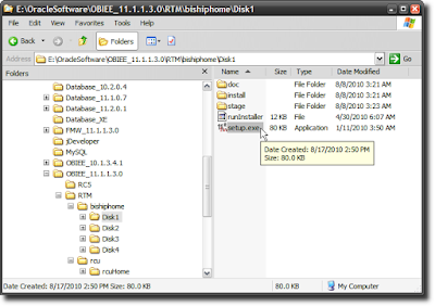
Navigate to the rcuHome\BIN folder and run the rcu.bat file (on Windows - I am running this example on a Windows 32-bit machine).
Select "Create" from the option radio-button, and click "Next".
Here you can select an Oracle Database, or click the dropdown to select another database. I will use Oracle Database, obviously.
While there are strategies you may want to employ when defining a prefix to your RCU schemas, since I am installing these schemas for my use on my laptop, I am going to keep things simple, and use a prefix of "RCUOBIEE". If I check the "Oracle Business Intelligence" box, you will notice that any dependent schemas also get checked. Which is neat.You will also notice that a name is suffixed to each of the schemas that are going to be created. Therefore, OBIEE gets a suffix of BIPLATFORM. This is because the Oracle BI EE suite is referred to as the "platform", sometimes, in discussions where we want to distinguish it from, say, "BI Applications". We call everything "BI", but this distinction is useful because we use the Oracle BI EE suite to build other products like Oracle BI Applications. The "platform" is also used by other groups inside Oracle to build custom analytics offerings. Anyway - trivia I thought I should share.
The remainder of the steps are fairly straightforward and self-explanatory. You click "OK' where there is an "OK" button, and "Next" where there is a "Next" button, "Create" where there is a "Create" button, and "Close" when you finally see a "Close" button. The whole process should not take more than a couple of minutes. Say 5 minutes, from start to finish.


And that, my friends, is a wrap, as far as the RCU story goes.
Sort of a post-wrap exercise may be, for those so interested, to launch Oracle SQL Developer, and peek a look at what sort of tables are created by the RCU. Your choice really.
If you choose to do so, this is what you would see.
The "ANNOT*" tables are used by the Scorecard product.
"QRTZ*" tables are used by BI Publisher, "CALC*", "HSS*" by Essbase and Oracle Hyperion products.
If you need to install OBIEE 11g (properly known as Oracle® Fusion Middleware Oracle Business Intelligence), you need to take a look at the Oracle® Fusion Middleware Quick Installation Guide for Oracle Business Intelligence
Also see Oracle® Fusion Middleware Repository Creation Utility User's Guide
 |
| RCU User's Guide |
 |
| Oracle BI EE Quick Install Guide |
The first is the Oracle Database part. You have to have a supported Oracle Database. I am going to skip over that step, since this post is about the RCU.
The second part is the RCU. You need to use the RCU to install schemas that Oracle BI EE requires. And that's what I am going to talk about.
The RCU is simply the "Repository Creation Utility". Simply put, the RCU lets you install certain schemas in a database that are required by Fusion Middleware products like Oracle BI EE. These schemas can be installed onto any certified version of database like Oracle Database, IBM DB2, or Microsoft SQL Server. There are schemas that are required by the core components of Oracle Fusion Middleware, while there are schemas that Oracle BI EE requires, like for the Scheduler, for BI Publisher, for the new Scorecard product.
You can download the installable for RCU from OTN, at the Oracle Business Intelligence (11.1.1.x) Downloads page. The Windows 32-bit downloadable is available at Microsoft Windows (32-bit), while the Linux x86 32-bit downloadable is available at Linux x86 (32-bit)
Once you have downloaded the RCU, unzip it to a folder.
Navigate to the rcuHome\BIN folder and run the rcu.bat file (on Windows - I am running this example on a Windows 32-bit machine).
 |
| The rcu.bat file to be run on a Windows machine |
Select "Create" from the option radio-button, and click "Next".
Here you can select an Oracle Database, or click the dropdown to select another database. I will use Oracle Database, obviously.
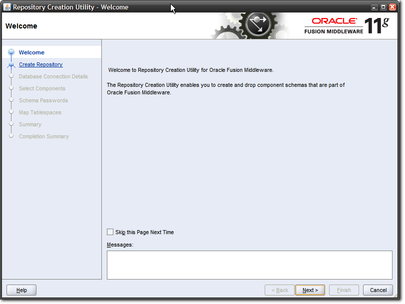 |
| RCU Welcome Screen |
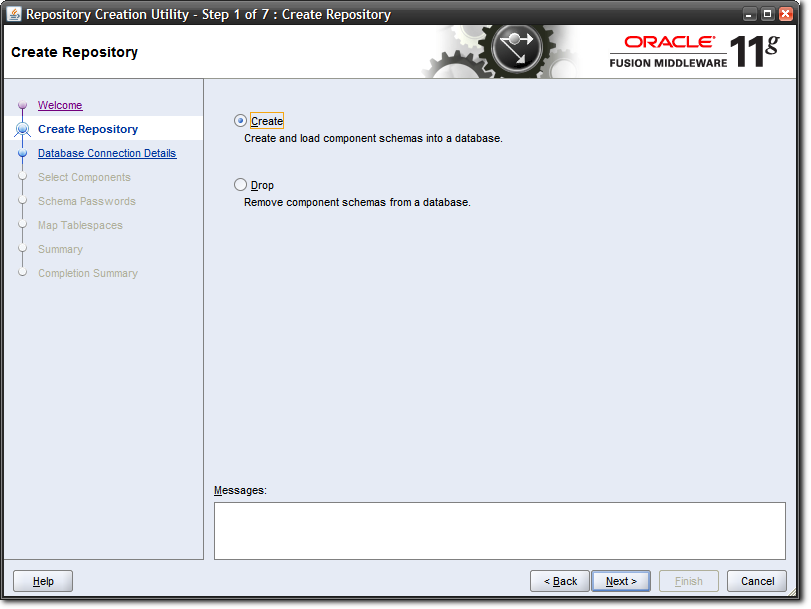 |
| Select the "Create" option |
 |
| Enter the details where your Oracle Database is running |
While there are strategies you may want to employ when defining a prefix to your RCU schemas, since I am installing these schemas for my use on my laptop, I am going to keep things simple, and use a prefix of "RCUOBIEE". If I check the "Oracle Business Intelligence" box, you will notice that any dependent schemas also get checked. Which is neat.You will also notice that a name is suffixed to each of the schemas that are going to be created. Therefore, OBIEE gets a suffix of BIPLATFORM. This is because the Oracle BI EE suite is referred to as the "platform", sometimes, in discussions where we want to distinguish it from, say, "BI Applications". We call everything "BI", but this distinction is useful because we use the Oracle BI EE suite to build other products like Oracle BI Applications. The "platform" is also used by other groups inside Oracle to build custom analytics offerings. Anyway - trivia I thought I should share.
The remainder of the steps are fairly straightforward and self-explanatory. You click "OK' where there is an "OK" button, and "Next" where there is a "Next" button, "Create" where there is a "Create" button, and "Close" when you finally see a "Close" button. The whole process should not take more than a couple of minutes. Say 5 minutes, from start to finish.
 |
| Select a prefix for the RCU schemas |
 |
| RCU Creation Process |
 |
| Selecting a password for the RCU schemas |
 |
| The default and TEMP tablespaces for the schemas |


 |
| About the start the actual schema creation process. |
 |
| RCU has completed creating the schemas |
And that, my friends, is a wrap, as far as the RCU story goes.
Sort of a post-wrap exercise may be, for those so interested, to launch Oracle SQL Developer, and peek a look at what sort of tables are created by the RCU. Your choice really.
If you choose to do so, this is what you would see.
 |
| Schemas created by RCU for OBIEE |
"QRTZ*" tables are used by BI Publisher, "CALC*", "HSS*" by Essbase and Oracle Hyperion products.
 |
| Tables in the RCUOBIEE_BIPLATFORM schema |
Subscribe to:
Posts (Atom)