There is an article that speculates on what Oracle might do with its acquisition of Innobase. It has comments from a Donald Feinberg, Gartner distinguished analyst and vice president (and also was an Oracle director for three years), who speculates that Oracle may use Innobase as an entry level offering to compete with similar offerings from Microsoft and Sybase. "This would give Oracle an entry-level relational database management system [DBMS] that would compete in this space with the further advantage of not exposing Oracle's DBMS source code to the open source community," Feinberg wrote in a recently published analysis.
And, on another note, Oracle now has a consolidated page where you can read about its recent acquisitions, all on one page - http://www.oracle.com/corporate/acquisition.html
In case you had lost count, the companies listed are PeopleSoft, Retek, TimesTen, ContextMedia, Siebel, Innobase, Oblix, TripleHop, ProfitLogic, i-flex, and G-Log.
I am off on vacation next week. It's holiday season in India; three days of holidays in Banglore, and then a couple of week after that are the Thanksgiving weekend in the US. And then there's Christmas and New Year - I like this part of the year :)
Update: corrected a typo in the blog title.
Thursday, October 27, 2005
Monday, October 24, 2005
More with the Spreadsheet Add-In - 10.1.2.1
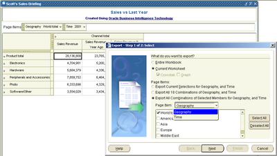
If you have used Discoverer OLAP, you may already know that you can choose to export all combinations of, or selected combinations of page-items in a worksheet (see the last screenshot in this post below). This can be particularly useful if you want to flatten out your results for further analysis in Excel (and never mind what I said about Excel and therapy in my earlier post). Well, the same functionality is available in the Spreadsheet Add-In also. And you because you are working in Excel to begin with, the results are available that much faster.
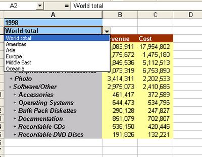
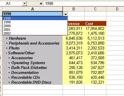
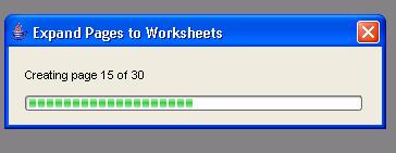
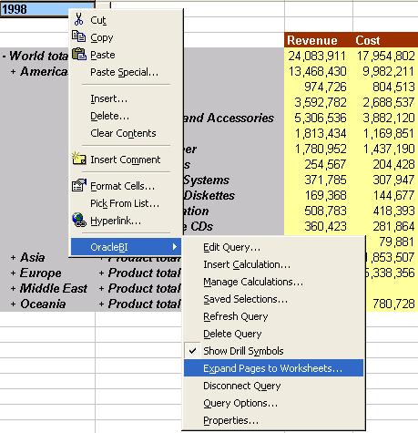
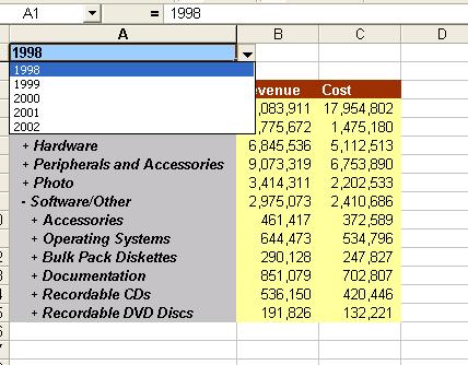
Taking the example below, I have a page-item in my query, Year, that has five values. I can use the context menu and click the option 'Expand Pages to Worksheets'.
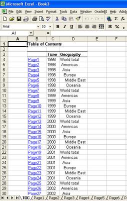
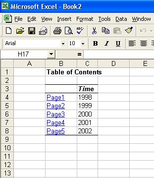
The Add-In creates a new workbook, and creates one sheet for each page-item value. To help users even more, it adds as the first sheet a table of contents, with links to all the sheets in the workbook.

This, the TOC, can be very useful if you have a lot of page-item combinations. See below: Year has five values, and the Region dimension at the given hierarchy has six members. Using simple arithmatic, 5x6 equals thirty (30).
And 30 can be a lot of sheets.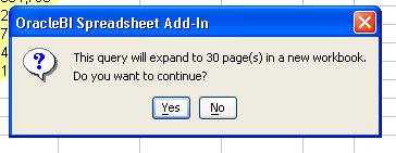
A TOC therefore is much more appreciated in this example. As you can see below, every combination of page-item values generated is linked, and the value combination listed for the user's benefit. Furthermore (and there really seems to be no end to the number of small but very useful things here), the members of the geography dimension are indented for readability.
The Discoverer OLAP screenshot with the option to export all or selected combinations of page-items.
Taking the example below, I have a page-item in my query, Year, that has five values. I can use the context menu and click the option 'Expand Pages to Worksheets'.
The Add-In creates a new workbook, and creates one sheet for each page-item value. To help users even more, it adds as the first sheet a table of contents, with links to all the sheets in the workbook.
This, the TOC, can be very useful if you have a lot of page-item combinations. See below: Year has five values, and the Region dimension at the given hierarchy has six members. Using simple arithmatic, 5x6 equals thirty (30).

And 30 can be a lot of sheets.


A TOC therefore is much more appreciated in this example. As you can see below, every combination of page-item values generated is linked, and the value combination listed for the user's benefit. Furthermore (and there really seems to be no end to the number of small but very useful things here), the members of the geography dimension are indented for readability.

The Discoverer OLAP screenshot with the option to export all or selected combinations of page-items.

Friday, October 21, 2005
Using the Spreadsheet Add-In - 10.1.2.1
This is not a tutorial on how to use the Spreadsheet Add-In, but more as a brief look at its basics...
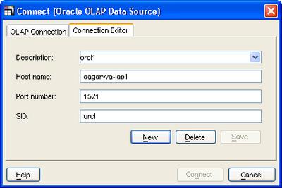
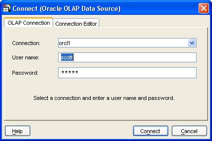
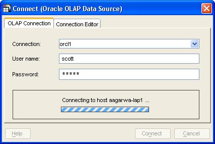
Once you have started the add-in, you have to connect to an Oracle OLAP data source. You have to define a connection first - which is the host name, port number, and the SID.
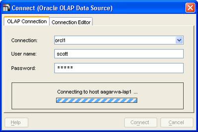
You can define multiple data sources in this manner, and using the 'OLAP Connection' dialog you select from one of those defined connections. Enter the user name, password, click 'Connect' and the familiar query builder is displayed upon a successful authentication.

While the Add-In attempts to establish a JDBC connection to the Oracle OLAP server you even get to see a nice little animation.
The familiar Query Builder is displayed - the same as what you see when using Plus OLAP. Because it is the same, that's why! Cool, isn't it? :-)
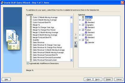
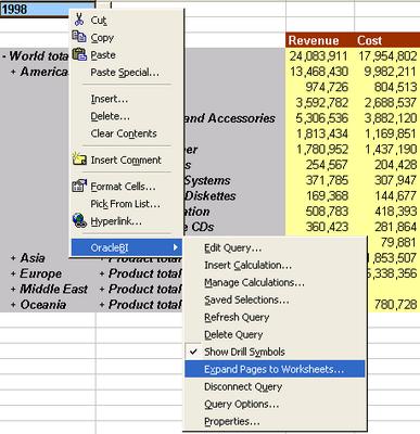
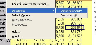
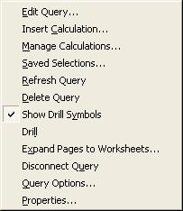
Anyway, I won't go into the intricacies or mechanics of query creation. Once the query displays in the Excel sheet, you can right-click any cell in the query to be displayed a context-menu, like the one shown below.

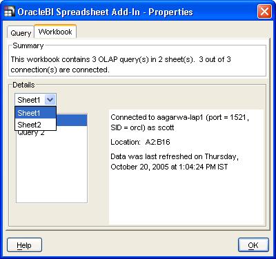
Now, there is no practical restriction on the number of OLAP queries you can have in a single sheet in Excel, or within an Excel workbook. This means that you may not know how many queries you have, or where they are. This is where the 'Properties' option from the Add-In context menu (or even from the menu) comes in handy. It will list how many OLAP queries in how many sheets you have in the current workbook. And in the details tab you get to see the connection details, cell location, and last-refresh date-time for each query.

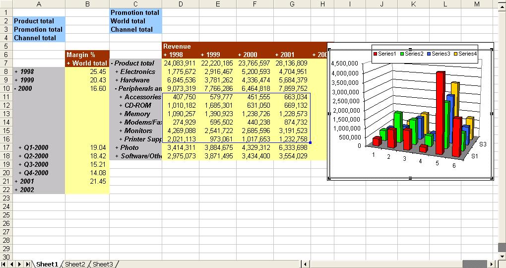
While recognizing that people who refuse to evolve out of Excel need therapy (I am quoting an analyst here), I also recognize that habits die hard, especially those formed as a result of certain market anomalies... So if you have an OLAP query, you can add totals to it, Excel charts, etc...
 I will look at the 'Expand Pages to Worksheets' option in a later post - though this is sort of similar to the 'Export all combinations of page-items' option when exporting data from Discoverer Plus OLAP.
Once you have started the add-in, you have to connect to an Oracle OLAP data source. You have to define a connection first - which is the host name, port number, and the SID.

You can define multiple data sources in this manner, and using the 'OLAP Connection' dialog you select from one of those defined connections. Enter the user name, password, click 'Connect' and the familiar query builder is displayed upon a successful authentication.
While the Add-In attempts to establish a JDBC connection to the Oracle OLAP server you even get to see a nice little animation.
The familiar Query Builder is displayed - the same as what you see when using Plus OLAP. Because it is the same, that's why! Cool, isn't it? :-)

Anyway, I won't go into the intricacies or mechanics of query creation. Once the query displays in the Excel sheet, you can right-click any cell in the query to be displayed a context-menu, like the one shown below.
Now, there is no practical restriction on the number of OLAP queries you can have in a single sheet in Excel, or within an Excel workbook. This means that you may not know how many queries you have, or where they are. This is where the 'Properties' option from the Add-In context menu (or even from the menu) comes in handy. It will list how many OLAP queries in how many sheets you have in the current workbook. And in the details tab you get to see the connection details, cell location, and last-refresh date-time for each query.


While recognizing that people who refuse to evolve out of Excel need therapy (I am quoting an analyst here), I also recognize that habits die hard, especially those formed as a result of certain market anomalies... So if you have an OLAP query, you can add totals to it, Excel charts, etc...
 I will look at the 'Expand Pages to Worksheets' option in a later post - though this is sort of similar to the 'Export all combinations of page-items' option when exporting data from Discoverer Plus OLAP.
Oracle's executive blogs
Some of Oracle executives, for now from the Apps group, have started blogging - that you can check out at http://www.oracle.com/corporate/executive/blog/index.html
For now you have blogs by John Wookey, Cliff Godwin, and Jesper Andersen. These don't appear to be in the traditional blog format, and don't seem to have been updated in almost a month, but I still hope that blogging will be recognized and organized as a legitimate and important channel of reaching out to our customers and user community. I believer blogging, by being more immediate and less formal, plays an important part in reaching out to a segment of users who may not be adequately covered by the existing forms of communication. Product management and development have an important part to play here, so here's to a long and popular OracleBI blog!
For now you have blogs by John Wookey, Cliff Godwin, and Jesper Andersen. These don't appear to be in the traditional blog format, and don't seem to have been updated in almost a month, but I still hope that blogging will be recognized and organized as a legitimate and important channel of reaching out to our customers and user community. I believer blogging, by being more immediate and less formal, plays an important part in reaching out to a segment of users who may not be adequately covered by the existing forms of communication. Product management and development have an important part to play here, so here's to a long and popular OracleBI blog!
Thursday, October 20, 2005
Installing the Spreadsheet Add-In - 10.1.2.1
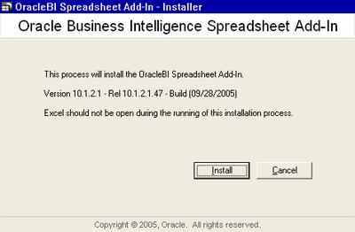
The installation procedure for the Spreadsheet Add-In is a bit different - the installer is not the regular Oracle Universal Installer (OUI) that comes with Oracle products, nor does it use the OPatch route.
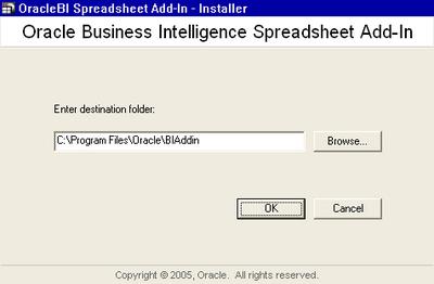
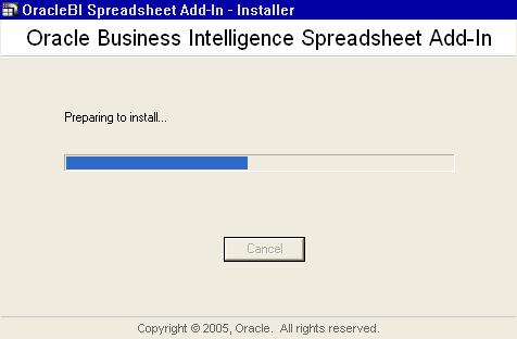
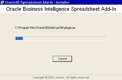
Once you click on the installable .exe file (OBISpAddinInst_10.1.2.1.47.exe), the first screen displayed is fairly simple - with two buttons, one to start the install, the other to cancel.
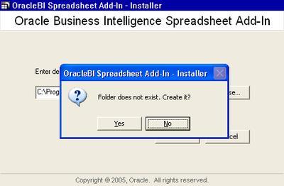
A default path is displayed, and you have the option of changing it.
A log file of the install process is written to "<install>\OracleBIAdd-InInstall.log" - which can be useful in the event of an unsuccessful installation.
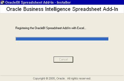
 If you have Excel running, this is the stage where errors will occur. One thing that I realized was that even if Excel does not seem to be running, it may still be alive as a process. So be sure to use your task manager to check for and end any Excel processes before you start the installation.
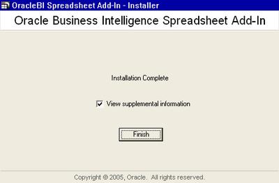
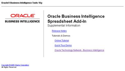
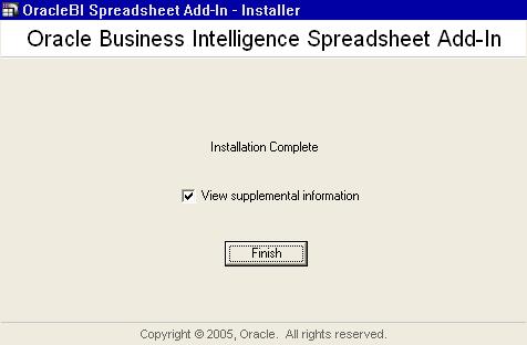
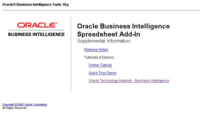
If you keep the 'View Supplemental Information' box checked, this page below is displayed upon clicking the 'Finish' button. The 'Quick Tour Demo' link launches a short Flash based demo of the Spreadsheet Add-In.
 Should the installation fail for any reason, you should make sure that Excel is not running, and re-run the installation - if you choose the same directory to install the Add-In in, the existing files will be overwritten (which is no cause for worry).
Once you click on the installable .exe file (OBISpAddinInst_10.1.2.1.47.exe), the first screen displayed is fairly simple - with two buttons, one to start the install, the other to cancel.

A default path is displayed, and you have the option of changing it.


A log file of the install process is written to "<install>\OracleBIAdd-InInstall.log" - which can be useful in the event of an unsuccessful installation.
 If you have Excel running, this is the stage where errors will occur. One thing that I realized was that even if Excel does not seem to be running, it may still be alive as a process. So be sure to use your task manager to check for and end any Excel processes before you start the installation.
If you keep the 'View Supplemental Information' box checked, this page below is displayed upon clicking the 'Finish' button. The 'Quick Tour Demo' link launches a short Flash based demo of the Spreadsheet Add-In.
 Should the installation fail for any reason, you should make sure that Excel is not running, and re-run the installation - if you choose the same directory to install the Add-In in, the existing files will be overwritten (which is no cause for worry).
New versions of AWM and Spreadsheet Add-In available
This has been announced on the OLAP and Spreadsheet Add-In forums on OTN:
AWM
A new version (10.1.2.1) of the OracleBI Spreadsheet Add-in is available for download from the product page:
http://www.oracle.com/technology/products/bi/spreadsheet_addin/index.html
It contains mainly bugfixes and performance enhancements. Please read the release notes for more information.
The readme is available here.
AWM
- Analytic Workspace Manager 10.2.0.1.0A is now available. You can find it on MetaLink as PS# 4656244 or OTN at http://www.oracle.com/technology/products/bi/olap/index.html.
- What is AWM 10.2.0.1.0A? It is a patched, stand-alone client that supercedes the version found on the Oracle Database Client CD for 10gR2.
- What's the background on AWM 10.2.0.1.0A? It was initially created to fix issues while connecting to Oracle OLAP 10.1.0.4.0 but over time picked up some other fixes.
- Which Oracle OLAP versions does AWM 10.2.0.1.0A work with? It works with Oracle OLAP 10.1.0.4.0 and above on the Oracle Database 10gR1 code stream and Oracle Database 10.2.0.1.0.
- Does AWM 10.2.0.1.0A require a corresponding Oracle OLAP 'A' patch to the database? No
- Is there scheduled an AWM 10.1.0.5 or any other future 10gR1 version? No, AWM 10.1.0.4 users can move to AWM 10.2.0.1.0A.
- You can download the file here. The readme is available here.
A new version (10.1.2.1) of the OracleBI Spreadsheet Add-in is available for download from the product page:
http://www.oracle.com/technology/products/bi/spreadsheet_addin/index.html
It contains mainly bugfixes and performance enhancements. Please read the release notes for more information.
The readme is available here.
Monday, October 17, 2005
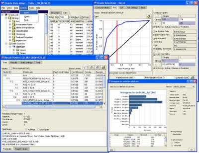
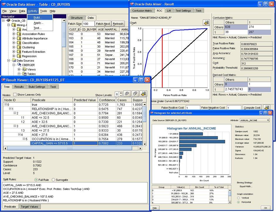
Oracle Data Miner 10gR2 beta now available, with a Discoverer bridge
This came in on Friday - a beta of Oracle Data Miner (1og R2) is now available for download. It requires Oracle Data Mining 10.2.
This also has a Discoverer bridge, so you can now directly push results to Discoverer.
This is how you would use the Discoverer bridge (this is reproduced verbatim from the installation instructions page):
Publish to OracleBI Discoverer Gateway
Tools | Publish to Discoverer Gateway uses OracleBI Discoverer Gateway to publish data mining result in OracleBI Discoverer. You can publish the following results:
Follow these steps to publish data mining results to OracleBI Discoverer:
If you just want to publish data mining results to the Oracle Data Miner Discoverer Gateway, no software is required in addition to Oracle Data Miner. If you intend to use published mining results in OracleBI Discoverer, the following software is required; in each case click the link to download the software:
1. If an EUL does not exist, create a new EUL.
Click these links for information about creating an a EUL in two different cases:
* Create an EUL for an existing database user
* Create an EUL in a new database user
2. Register the Oracle Data Miner Discoverer Gateway with the EUL:
Execute the following SQL script in the EUL user to register the Oracle Data Miner Discoverer Gateway with the EUL:
-- registration script
insert into EUL5_GATEWAYS(
gw_id, -- Gateway ID
gw_type, -- Type of Gateway
gw_gateway_name, -- Name of Gateway
gw_product_name, -- Name of the product
gw_description, -- Description of the gateway
egw_version, -- version of the gateway
egw_database_link, -- For remote DB provide dblink
egw_schema, -- Gateway owner
egw_sql_paradigm, -- SQL paradigm
gw_element_state, -- element state
gw_created_by, -- who created this gateway
gw_created_date, -- when it was created
gw_updated_by, -- who updated this gateway
gw_updated_date, -- when it was updated
notm
)
values
(
EUL5_ID_SEQ.NEXTVAL,
'EGW',
'ODMr 10.2 Discoverer Gateway',
'Oracle Data Mining',
'This gateway provides data mining results accessible to OracleBI',
'1.1',
NULL, -- dblink if dmuser is in remote
'DMUSER', -- Change to the schema as needed
'OBJECT',
0,
USER,
SYSDATE,
USER,
SYSDATE,
0
)
Update:
Added links to Oracle Data Mining:
Oracle Technology Network (OTN) Discussion Forums:
This also has a Discoverer bridge, so you can now directly push results to Discoverer.
Oracle Data Miner Release 2 introduces the popular Decision Tree algorithm for classification problems that can provide human readable “IF…, THEN… rules” that communicate the relationships discovered by ODM. The new Anomaly Detection algorithm flags rare events and supports fraud and compliance monitoring. Oracle Data Miner improves support for assembling the data including unstructured “text” data for mining. Oracle Data Miner also supports PREDICT and EXPLAIN “one-click data mining” predictive analytics. Release 10gR2 adds Receiver Operating Characteristics support for model evaluation and tuning. Oracle Data Miner can automatically generate the Java and SQL components needed to transform the data mining steps into an integrated data mining/BI enterprise application. Lastly, a new Gateway to Oracle Discoverer enables data analysts to publish their results for viewing through Oracle Discoverer.You can download the software from here - Oracle Data Miner 10.2.0.1 (37MB). The release notes and installations instructions are available here.
With Oracle Data Miner and Oracle Data Mining, the data never leaves the database: all data movement is eliminated. In addition, Oracle Data Miner and Oracle Data Mining provide the security of the Oracle database.
This is how you would use the Discoverer bridge (this is reproduced verbatim from the installation instructions page):
Publish to OracleBI Discoverer Gateway
Tools | Publish to Discoverer Gateway uses OracleBI Discoverer Gateway to publish data mining result in OracleBI Discoverer. You can publish the following results:
- Attribute Importance
- Association Rules
- Apply Results
- Decision Tree Rules
- Clustering Rules
- Classification Test Metrics
Follow these steps to publish data mining results to OracleBI Discoverer:
- Install required BI and OracleBI Discoverer components.
- Create a new EUL using OracleBI Discoverer.
- Register the Oracle Data Miner Gateway with the EUL.
- Use Oracle Data Miner to publish results to OracleBI Discoverer.
- Add Oracle Data Miner gateway objects as folders in a business area using OracleBI Discoverer Administration.
If you just want to publish data mining results to the Oracle Data Miner Discoverer Gateway, no software is required in addition to Oracle Data Miner. If you intend to use published mining results in OracleBI Discoverer, the following software is required; in each case click the link to download the software:
- Oracle BI 10.1.2.0.0 or higher
- Oracle Developer Suite 10.1.2.0.0 or Higher: OracleBI Discoverer Administrator is required; other components of the suite are optional.
- Patch 7595805 for OracleBI Discoverer Administrator, available from Patch Request 7595805; if this patch is not installed, the gateway will not work.
1. If an EUL does not exist, create a new EUL.
Click these links for information about creating an a EUL in two different cases:
* Create an EUL for an existing database user
* Create an EUL in a new database user
2. Register the Oracle Data Miner Discoverer Gateway with the EUL:
Execute the following SQL script in the EUL user to register the Oracle Data Miner Discoverer Gateway with the EUL:
-- registration script
insert into EUL5_GATEWAYS(
gw_id, -- Gateway ID
gw_type, -- Type of Gateway
gw_gateway_name, -- Name of Gateway
gw_product_name, -- Name of the product
gw_description, -- Description of the gateway
egw_version, -- version of the gateway
egw_database_link, -- For remote DB provide dblink
egw_schema, -- Gateway owner
egw_sql_paradigm, -- SQL paradigm
gw_element_state, -- element state
gw_created_by, -- who created this gateway
gw_created_date, -- when it was created
gw_updated_by, -- who updated this gateway
gw_updated_date, -- when it was updated
notm
)
values
(
EUL5_ID_SEQ.NEXTVAL,
'EGW',
'ODMr 10.2 Discoverer Gateway',
'Oracle Data Mining',
'This gateway provides data mining results accessible to OracleBI',
'1.1',
NULL, -- dblink if dmuser is in remote
'DMUSER', -- Change to the schema as needed
'OBJECT',
0,
USER,
SYSDATE,
USER,
SYSDATE,
0
)
Update:
Added links to Oracle Data Mining:
Oracle Technology Network (OTN) Discussion Forums:
Out of town, with a busy two weeks coming up...
Been out of town on vacation the last week, and the next two weeks promise to be busy at work. Don't know if I will be able to post much during this time...
Thursday, October 06, 2005
Queries you can easily understand.....
Recently two major BI companies, no names no pack drills, have tried to take as many column inches as possible in the technical press to try to push an allegedly, revolutionary new idea. What could this possibly be? Well brace yourselves - it is the ability to create a query using an English-like syntax and then save that query so it can be reused.
- Discoverer 10g
- BI Spreadsheet Addin for Excel
- Business Intelligence Beans
- Reports OLAP pluggable data source
From an Oracle perspective - Been there, seen it, done that and got the t-shirt. Just in case you have not seen this feature within BI10g, lets try some simple English questions to explain how this all works:
- How do I create a query?
- How do I create a multi-step query?
- Can I check my query?
- Can I save my query and reuse it?
How Do I Create a Simple Query?
Discoverer 10g make the query building process so easy. We allow you to manually select dimension members using your mouse. You can drill down through your hierarchies and select any member or group of members to include in your presentation. But where is the power in that?
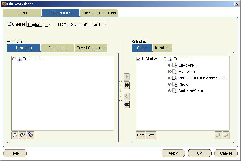
The real power of Discoverer comes when you create conditions by clicking on the 'Conditions' tab. To make this as simple as possible we provide templates that guide you through the process of creating just about any query you could think of. Want to create a query to select the top 3 products based on a 6 month moving average for sales revenue? No problem – we have just the template for you….
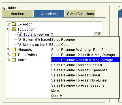
The really nice thing is that each template is driven by hyperlinks, an idea that we have patented. So you find the template that sounds similar to the query you want to create and then just use the hyperlink to modify the template to meet your exact requirements. There is a large library of templates so you can build any query you could ever want.
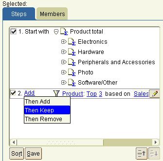
How do I create a multi-step query?
Many business queries need to contain multiple steps, so how do you make this process as easy as possible. Very simple, we translated the whole join process as well. Now you can use terms like Add, Keep or Remove to further describe how steps interact with each other.
How do I check my query?
After creating a query that contains multiple steps this is an obvious question, and one that definitely needs to be answered. Fortunately, Discoverer can again answer this question with one click. We have provided a Members tab that will allow you to check your query before running the complete query.
Can I save my query and reuse it?
Absolutely, we even provide a Save button so you can reuse your queries. This is actually a huge feature as it allows you to create a query and share it across multiple presentations. Need to change the query and update all those presentations? No problem, just change the saved query and every presentation will automatically adopt the new saved query. Now that really is powerful.
Discoverer 10g allows you to just drag and drop any of those saved queries right into your presentation directly from your BI catalog. What could be simpler?

So remember folks, despite what you might read to the contrary elsewhere, you heard it here first - ' Create your queries using English with Oracle BI10g'.
Open World 2005 Attendance Graphs - with Discoverer
What's the good thing about eating your own dog food? Before you think I have meandered into a discourse on canine culinary dietetics, let me assure that I only use this phrase to refer to the practice of a company using its own products internally. Therefore, in the context of BI, you should have guessed by now that I am referring to using Oracle BI 10g to report on all sorts of data.
The session/track attendance numbers from the San Francisco Oracle Open World came out late last week, and a couple of PMs from the BI group took those numbers, built a Discoverer EUL on top of it, and cranked out a number of reports, and all in less time than it would take to say 'Wow! That was quick, and good!' (btw - the final numbers were that more than 35,000 people attended Open World! And if the Siebel acquisition goes through, then expect that number to go up even more!)
This post is not really about the data per-se, but more of a followup on the last couple of posts from Keith and me on the value of graphs and the huge number of very useful graphs already available in BI 10g - Discoverer, Beans, etc... (specifically, see 'Making more of BI Graphs' and 'More on the bubble graph').
Bubble graph - here the X-axis represents the number of sessions , Y-axis the average attendance per session, while the size of the bubble is the percentage of sessions in a track that were more than the conference average. A standard pie graph, each slice represents a primary track, and the percentage figures are for total track attendance.
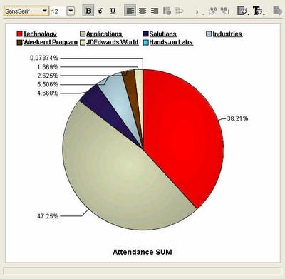 Click on the 'Technology' track legend label, or double-click the pie slice, and the pie graph updates with percentages for the Tech-tracks. The database continues to garner the lion's share of the attendees, with the application server following at 25%, and BI-DW in third place in a little over 10% share of all Tech-track attendees.
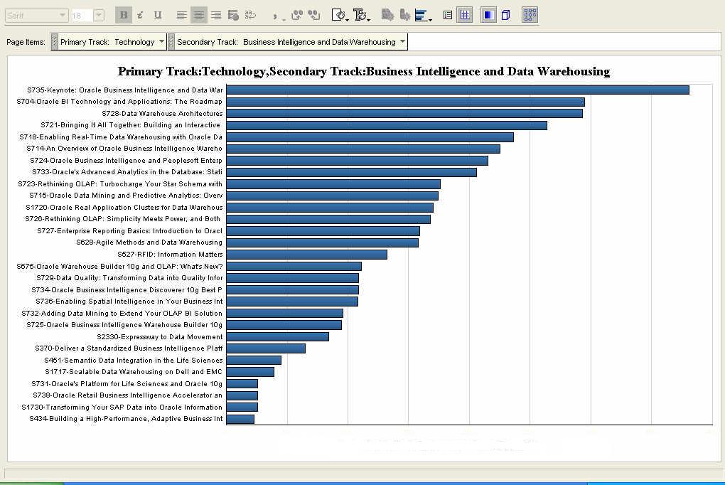
 And this is an example of running amok with a pie chart. And also illustrates very nicely how a different graph may make this data look much more readable. The pie chart below shows attendance percentage figures for all the BI-DW track sessions, all 29 of them. Not very useful, right? Let us take a look at the next graph then.
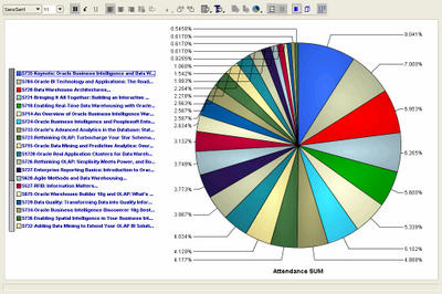 This is a graph showing the same data, but this time as a horizontal bar graph. That's it. A simple click of the mouse, and I changed the graph type from 'pie' to 'horizontal bar'! When we say Discoverer is simple to use, we are serious.
Ray's BI keynote was, unsurprisingly, the most heavily attended session. This was also the only keynote for the BI-DW track. And this session was also the one where the now-fabled Report Center was shown, publicly, for the first time. (Disclaimer: I am not saying that Report Center will be called Report Center when it ships, if it ships. Take it only as a demonstration vehicle of concepts and designs we have been working on internally, nothing more, nothing less.)

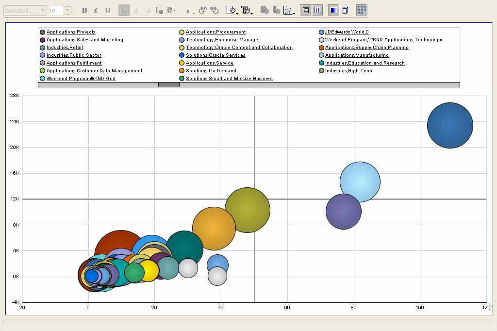
Below are two bubble graphs, showing the same data, but the second displays a smaller set than the first one. The X-axis shows the number of sessions, while the Y-axis shows the total number of attendees for the track. The size of the bubble is the average attendance per session. But with so many sessions, this magic quadrant is not very readable, is it?
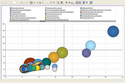 Here I have taken the same graph as above, but applied a ranking filter to display only the top 10 sessions - where the ranked measure is total number of attendees. BI-DW is the bright red bubble, below and to the left of the orang-ish bubble. This is only one way of showing the bubble graph - you could decide that the size of the bubble should be the number of sessions, and that average attendance should be plotted as an ordinate or abscissa. Either way it's your choice.
 Pareto graphs are very useful for performing 80-20 type of analysis. The bars show the values that make the whole, while the line shows the cumlative percentage contribution of the individual parts thus. It is sometimes also called a 80-20 graph because these graphs illustrate very vividly the fact that usually 80% of something is contributed by 20% of its constitutents. E.g. 80% of a company's profits may be coming from only 20% of the products it sells. Here in this example it should come as no surprise that applications and technology accounted for more than 80% of all attendance.
 Update: I posted this, and then realized that I hadn't answered the semi-rhetorical question I had posed at the start of this post, "What's the good thing about eating your own dog food?". Well, I am hoping that people won't really expect an answer to it, after having read the post, but for the sake of completeness: when you eat your own dog food, you use the product like a customer. Which means that you are not using it as a developer, or QA engineer, or product manager, or support engineer, or sales person. You are using it like a customer would, doing the things a customer would, and the things that you would try and rationalize about as a developer, you will positively get irritated with, as a customer. And this then engenders the most valuable and useful feeling that we as product managers and developers and testers should and must have: empathy!
The session/track attendance numbers from the San Francisco Oracle Open World came out late last week, and a couple of PMs from the BI group took those numbers, built a Discoverer EUL on top of it, and cranked out a number of reports, and all in less time than it would take to say 'Wow! That was quick, and good!' (btw - the final numbers were that more than 35,000 people attended Open World! And if the Siebel acquisition goes through, then expect that number to go up even more!)
This post is not really about the data per-se, but more of a followup on the last couple of posts from Keith and me on the value of graphs and the huge number of very useful graphs already available in BI 10g - Discoverer, Beans, etc... (specifically, see 'Making more of BI Graphs' and 'More on the bubble graph').
Bubble graph - here the X-axis represents the number of sessions , Y-axis the average attendance per session, while the size of the bubble is the percentage of sessions in a track that were more than the conference average.
 A standard pie graph, each slice represents a primary track, and the percentage figures are for total track attendance.
 Click on the 'Technology' track legend label, or double-click the pie slice, and the pie graph updates with percentages for the Tech-tracks. The database continues to garner the lion's share of the attendees, with the application server following at 25%, and BI-DW in third place in a little over 10% share of all Tech-track attendees.
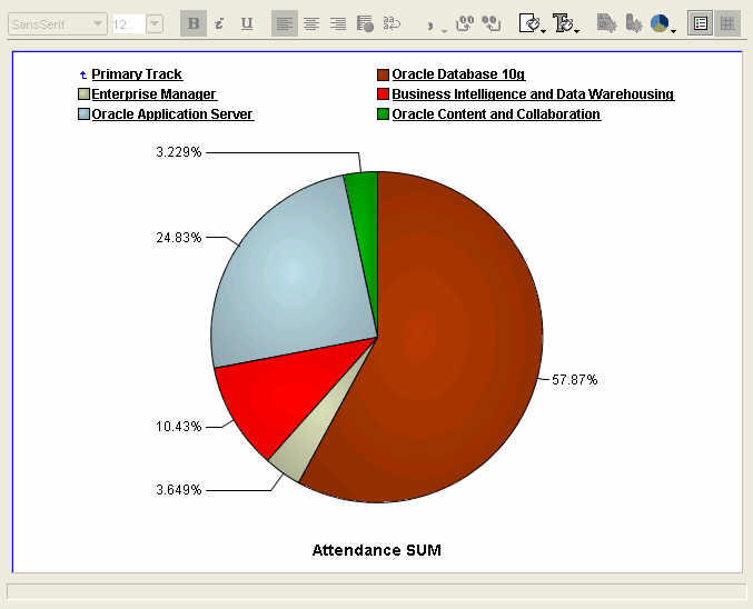 And this is an example of running amok with a pie chart. And also illustrates very nicely how a different graph may make this data look much more readable. The pie chart below shows attendance percentage figures for all the BI-DW track sessions, all 29 of them. Not very useful, right? Let us take a look at the next graph then.
 This is a graph showing the same data, but this time as a horizontal bar graph. That's it. A simple click of the mouse, and I changed the graph type from 'pie' to 'horizontal bar'! When we say Discoverer is simple to use, we are serious.
Ray's BI keynote was, unsurprisingly, the most heavily attended session. This was also the only keynote for the BI-DW track. And this session was also the one where the now-fabled Report Center was shown, publicly, for the first time. (Disclaimer: I am not saying that Report Center will be called Report Center when it ships, if it ships. Take it only as a demonstration vehicle of concepts and designs we have been working on internally, nothing more, nothing less.)
Below are two bubble graphs, showing the same data, but the second displays a smaller set than the first one. The X-axis shows the number of sessions, while the Y-axis shows the total number of attendees for the track. The size of the bubble is the average attendance per session. But with so many sessions, this magic quadrant is not very readable, is it?
 Here I have taken the same graph as above, but applied a ranking filter to display only the top 10 sessions - where the ranked measure is total number of attendees. BI-DW is the bright red bubble, below and to the left of the orang-ish bubble. This is only one way of showing the bubble graph - you could decide that the size of the bubble should be the number of sessions, and that average attendance should be plotted as an ordinate or abscissa. Either way it's your choice.
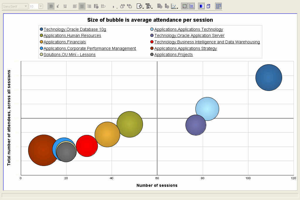 Pareto graphs are very useful for performing 80-20 type of analysis. The bars show the values that make the whole, while the line shows the cumlative percentage contribution of the individual parts thus. It is sometimes also called a 80-20 graph because these graphs illustrate very vividly the fact that usually 80% of something is contributed by 20% of its constitutents. E.g. 80% of a company's profits may be coming from only 20% of the products it sells. Here in this example it should come as no surprise that applications and technology accounted for more than 80% of all attendance.
 Update: I posted this, and then realized that I hadn't answered the semi-rhetorical question I had posed at the start of this post, "What's the good thing about eating your own dog food?". Well, I am hoping that people won't really expect an answer to it, after having read the post, but for the sake of completeness: when you eat your own dog food, you use the product like a customer. Which means that you are not using it as a developer, or QA engineer, or product manager, or support engineer, or sales person. You are using it like a customer would, doing the things a customer would, and the things that you would try and rationalize about as a developer, you will positively get irritated with, as a customer. And this then engenders the most valuable and useful feeling that we as product managers and developers and testers should and must have: empathy!
Wednesday, October 05, 2005
More on the bubble graph
Keith posted a note on the power of the different types of visualizations available in Discoverer (Making More of BI Graphs...), and mentioned the bubble graph in particular.
The bubble graph is also my favourite - and have a couple of examples to illustrate its power.
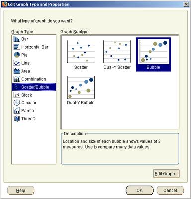
Using the data from the BI Samples (available from OTN), I have used Discoverer to create a workbook that shows me how my product categories are doing - i.e. margins, sales, and change in margin over last year. And I want to see things in perspective - margins and changes in margin will be of greater interest for those products (or product categories) for my volume sellers. I can either use this crosstab as the basis for analysis, or I can crete a bubble graph as shown below: the bubble graph is a graph subtype available under the 'Scatter/Bubble' graph type.
 Click 'OK' and your graph is plotted. Simple as that - takes all of five seconds, maybe a little longer if you get distracted looking at all the other fabulous graph types Discoverer offers.
Take a look below:
- On the X-axis I have margin (the first column in my crosstab)
- On the Y-axis I have the change in margin over last year (the second column in my crosstab)
- The size of the bubble is the sales revenue measure (the third column in my crosstab above)
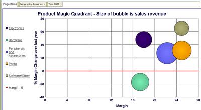 I should be a happy person here, reasonably speaking - most of my product categories are in the top-right quadrant, which means that not only are margins healthy, but they have also grown nicely over last year. But I do have one product category in the bottom-right quadrant - Hardware - that I may want to investigate to see if the problem can be isolated in a specific product sub-category.
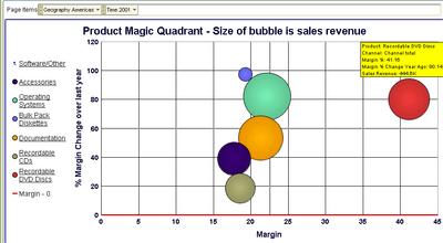
Or, I may want to analyze the 'Software/Others' product category (the top most bubble) further.
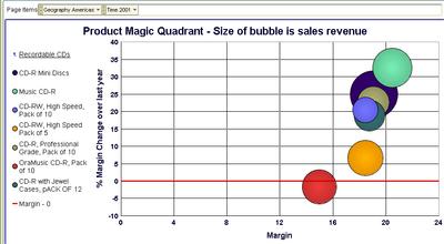
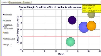 If I double-click the 'Software/Other' bubble (or click its legend label on the left) I see that 'Recordable DVD Discs' are (unsurprisingly) doing good. But the rest are displaying only middling sort of performance - they are more in the left side of the box than the right. 'Recordable CDs' is in fact the laggard product sub-category here.
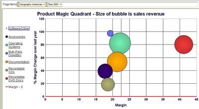 Drilling down the 'Recordable CDs' sub-cat tells me that my 'Jewel cases pack of 10' sell the most in this sub-cat, and aren't doing too badly. Maybe I should focus on this item to make sure I can keep its margins shored up. Or maybe I need to cut out 'CD-R pack of 10' from my product-mix since they are showing falling margins, and are likely to prove to be a drag on my bottom line.
 Returning to my parent product sub-category of 'Software-Others' (by simply clicking the 'Recordable CDs' link in the legend, the one with the up-arrow).
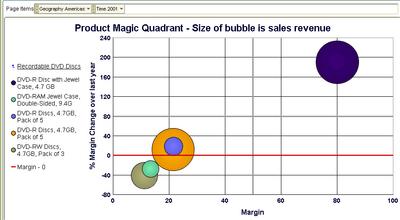
Here I want to look at my 'star' - Recordable DVD Drives - a little more.
 Yikes! Something is wrong here - while the single 'DVD-R Disc with jewel case' is a real hot seller, and with health margins too, every other product is actually giving me low single-digit margins. And two of those products are actually seeing shrinking margins. Time for action - I may want to drill to detail, to the transactional level, and see the individual sales transaction rows (and you can do that with Discoverer!).
 As you can see, a bubble graph goes a long way beyond the simple (and simplistic) bar graph types - sometimes you don't need to use fancy and overly complicated visualizations to get insight into your data. The tools and the means are all right there - at your fingertips. Analyzing three different measures in a single graph is not always easy, but the bubble graph is a particularly well-suited graph for the purpose.
The bubble graph is also my favourite - and have a couple of examples to illustrate its power.
Using the data from the BI Samples (available from OTN), I have used Discoverer to create a workbook that shows me how my product categories are doing - i.e. margins, sales, and change in margin over last year. And I want to see things in perspective - margins and changes in margin will be of greater interest for those products (or product categories) for my volume sellers.
 I can either use this crosstab as the basis for analysis, or I can crete a bubble graph as shown below: the bubble graph is a graph subtype available under the 'Scatter/Bubble' graph type.
 Click 'OK' and your graph is plotted. Simple as that - takes all of five seconds, maybe a little longer if you get distracted looking at all the other fabulous graph types Discoverer offers.
Take a look below:
- On the X-axis I have margin (the first column in my crosstab)
- On the Y-axis I have the change in margin over last year (the second column in my crosstab)
- The size of the bubble is the sales revenue measure (the third column in my crosstab above)
 I should be a happy person here, reasonably speaking - most of my product categories are in the top-right quadrant, which means that not only are margins healthy, but they have also grown nicely over last year. But I do have one product category in the bottom-right quadrant - Hardware - that I may want to investigate to see if the problem can be isolated in a specific product sub-category.
Or, I may want to analyze the 'Software/Others' product category (the top most bubble) further.
 If I double-click the 'Software/Other' bubble (or click its legend label on the left) I see that 'Recordable DVD Discs' are (unsurprisingly) doing good. But the rest are displaying only middling sort of performance - they are more in the left side of the box than the right. 'Recordable CDs' is in fact the laggard product sub-category here.
 Drilling down the 'Recordable CDs' sub-cat tells me that my 'Jewel cases pack of 10' sell the most in this sub-cat, and aren't doing too badly. Maybe I should focus on this item to make sure I can keep its margins shored up. Or maybe I need to cut out 'CD-R pack of 10' from my product-mix since they are showing falling margins, and are likely to prove to be a drag on my bottom line.
 Returning to my parent product sub-category of 'Software-Others' (by simply clicking the 'Recordable CDs' link in the legend, the one with the up-arrow).
Here I want to look at my 'star' - Recordable DVD Drives - a little more.
 Yikes! Something is wrong here - while the single 'DVD-R Disc with jewel case' is a real hot seller, and with health margins too, every other product is actually giving me low single-digit margins. And two of those products are actually seeing shrinking margins. Time for action - I may want to drill to detail, to the transactional level, and see the individual sales transaction rows (and you can do that with Discoverer!).
 As you can see, a bubble graph goes a long way beyond the simple (and simplistic) bar graph types - sometimes you don't need to use fancy and overly complicated visualizations to get insight into your data. The tools and the means are all right there - at your fingertips. Analyzing three different measures in a single graph is not always easy, but the bubble graph is a particularly well-suited graph for the purpose.
Monday, October 03, 2005
Making more of BI Graphs....
I have spent a lot of time reviewing client applications as well as demos we build here at Oracle and I am always amazed at how few different graph types are actually used. In Discoverer today we ship over 70 different graph types, yet just about every graph I see is either a bar, line or pie chart. It is true these are probably the three main graph types that the majority of users are most comfortable working with. However, many of the other graph types we expose can provide additional insight into your data.
If we actually plotted some data for this subject area we might generate graphs somthing like this:
My favorite graph type is the Bubble Graph.
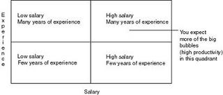
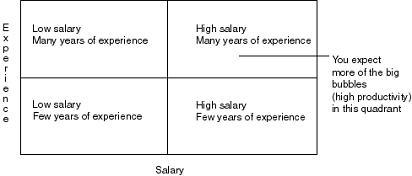
Most people are familiar with this type of graph as it used extensively by market research companies and is often referred to as a “magic quadrant”. The Discoverer Help system provides the following help text for bubble graphs:
Bubble - graphs to show data in a similar way to a scatter graph, but with an extra dimension that uses the size of the bubbles. Each bubble is a value whose coordinates are specified by three numeric measures. A bubble graph is useful for comparing data that has three measures.
This type of graph is perfect for helping to both identify and quantify business issues all at the same time. The term magic quandrant is often used because the graph can be divided into four sectors and each sector has a specific meaning. Usually the top right is the best place for your data points but it all depends on the message you are trying to convey.
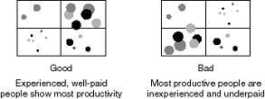
To take a simple example, you could use a bubble graph to plot salaries, years of experience, and productivity for your work force. You expect higher salaries for more experienced employees, and you expect these employees to be more productive.
If we actually plotted some data for this subject area we might generate graphs somthing like this:

I have used this graph quite a lot in recent demos and in some customer implementations since it is the easiest way to view a relationships between different measures. My favorite example is from the retail arena where we used bubble charts to solve a specific business problem. Every Monday, category managers would review sales and production data from the previous week. Typically each manager would be responsible for over 100 different products. They had a very short time to analyze the data and place orders with the various buying groups to either plan to order more or to slow production. The problem was how to present sales and production data in an intelligent way to allow the managers to focus on those items that generate the most margin for the company.
We used bubble charts as the starting point for analyzing their products. On the X-axis we plotted 4-week sales and on the Y-axis we plotted 4-week production data. The size of each bubble was derived from the product margin. The aim was to have products in the top right quadrant as this indicated high sales and high production. Any categories in the lower right or upper left quadrants were either selling well but planned production was not high enough or production was too high for the level of sales and so stock would be increasing. This made it very easy to identify the problem categories.
However, within those categories which ones should you select for further analysis? You could drill down on each and every bubble, but that would take a long time. By focusing on those categories that have the biggest bubble, i.e. those with the highest margin, the category managers could focus on those categories that were likely to have the highest impact on their overall profit. It was simple and extremely effective.
Subscribe to:
Comments (Atom)