Pages

Tuesday, October 09, 2012

BI Mobile App with iOS 6 Support

A new version of the "Oracle Business Intelligence Mobile HD" app for the Apple iPad became available for download earlier in the day. This is version 11.1.1.6.2.1238, and it has been updated to support iOS 6.

Happy downloading.
The link to the app's iTunes page: http://itunes.apple.com/us/app/oracle-business-intelligence/id534035015?mt=8

Screenshot of BI Mobile HD App on iTunes
This, below, is a screenshot of the App Store updates screen. As you can see, the list of apps requiring updating on your iPad will include the Oracle BI Mobile HD app.
Screenshot of the App Store 'Updates' screen

Happy updating. Happy analyzing.
Take care, and have a good day.
Abhinav
Bangalore, Oct 09, 2012


Monday, October 08, 2012

On Maps - 1

This is a short post. I hope. I do not know how long this will be, so this is more of an apriori statement. In any case, I have decided to make this a series of posts. This one will be, to make my initial statement true, a short post. I will lay out what I intend to describe in this series, why I intend to describe these points, and finally, how I intend to do the same. If that sounds very academic, do not worry. I shall endeavor to keep it light, frothy, bubbly, and fun. In any case, before I inject fun into this post, let me start by first stating that whatever I state in this post is my personal opinion, and that nothing I write should be taken as a statement of Oracle's product direction, nor a commitment to deliver features, in any release, etc... You know - the standard disclaimers. In any event, I will not, repeat, rinse, repeat - NOT - be talking about future functionality. Because, in the words of the Doc, "the future's not written".

It turns out, after speaking with customers, partners, and even people inside Oracle, and even books, that there is lingering confusion as to what map views are, how they work, what they can do, what they cannot do, what they should do, and so on. Part of this confusion arises from the fact that maps are not textual data visualizations. They aren't even graphical visualizations, in the strictest of senses, but more cartographic data visualizations.
They are close, in a lot of ways, to graphical visualizations, however, for the following reasons:
1. The representation of a metric on a map requires two separate components. One is, obviously, the data. Like "Yearly Revenue by State", or "Billed Quantity by Product Brand by Country", and so on. The second component that is required to complete a map visualization is the format. Yes, there is a third component here, but it is not essential in some cases, as I will demonstrate, but later. The second component is the choice of the data format. Map Views today support three types of geometries - polygonal, point, and linear.

2. For each geometry, different data formats are supported. Therefore, for polygons, you have at least six formats supported: a color fill, which in turn supports three different types of algorithms for determining the colors of the shapes; a bubble format, a variable shape, a bar graph, a pie chart, and even image formats. Sometime during development, we had yet another format that we wanted to support, but because of reasons that I will not get into, I, as the product manager, had requested that we remove it. And so it got removed. Anyway, the point is that data requires a format, which in turns is determined by the an attribute of the data we want to create a format on.

3. A tile. Wallpaper. Say what? Say this - if I were to format a metric by states of the US, you may or may not be able to make out the states quite so well. If, however, I were to plant a map of the United States below the formats, you would not have so much trouble now, would you? Precisely! The background map, the basemap, the tile layers - and we will eventually get into what these animals are - help provide context.

So what about the chart? A chart, like a pie, a bar, a scatter plot, etc... all are graphical representations of data, aren't they? You have numbers, and then you, as the data analyst, the report author, make a decision as to how those numbers should be visualized. The choice can be sometimes and somewhat arbitrary, and the less aware of best practices in data visualization the user, the more arbitrary these choices are likely to be. However, there is an element of choice involved in how data is visualized, and this choice in turn determines how the data is perceived and understood by the user.

Don't we have textual data visualizations that afford the same choices? Well, yes and no. You have table views, pivot views, and some other views that Oracle BI offers that are textual in nature, but that's about it. You can also determine the font, the color, the size of the numbers and text in the view, and you can also determine the order in which the data should be presented, but that's about it - it is, at the end of the day, or the night, still textual in appearance.

Next steps: I will add screenshots to this post to illustrate my points. But later.

Thank you. Take care.
Abhinav.
Bangalore, Oct 08, 2012

Thursday, September 27, 2012

Now Shipping - Oracle BI 11g Dev Guide


I noticed a couple of days ago that Mark Rittman's much-awaited book, Oracle Business Intelligence 11g Developers Guide, has now started shipping. It's been in the works for a few years, and I first heard about it from Mark in 2006, so yes - it's been in the works for many years. The reasons for the time it's taken are many, but the good news is that it is now available, and knowing Mark's extensive experience in business intelligence in general and with Oracle's business intelligence and data warehousing product portfolio, this should prove to be very helpful to BI professionals. I am reading it (courtesy Mark and Betty at McGraw-Hill - yes, disclosure) even as we speak - no, wait, that's a terrible cliche to use. Scratch that. I am reading the book, and I will try and put up initial impressions next week. In the meantime, go check the book out. Take note that this is a massive 1000+ page book, so it's not exactly a Harry Potter and the Goblet of Fire sort of a bedside read.

If you get the e-book version, I gather it's got some additional and more recently updated material on Trellis visualizations as well as Exalytics and the 11.1.1.6.2BP1 release.

Kindle Excerpt


Happy reading, and take care.
Abhinav.
27 Sep, 2012, Bangalore


Monday, September 24, 2012

GRC Book Giveaway

Yes, I heard you. What's a GRC (Governance, Risk, and Compliance) book give-away doing on an analytics blog? Well, the short of it is that PackT Publishing are giving away two e-book copies of their book, Governance, Risk, and Compliance Handbook for Oracle Applications, written by Nigel King and Adil Khan.

So, if you are interested in getting your hands on an e-book version of this book, please take a look at this tweet, https://twitter.com/oracle_biee/status/250276120031813632, and reply to the tweet with a comment on why you would like this book. The contest will remain open for 10 days, and at the end of the 10 days, two people will be selected to receive the book.


Governance, Risk, and Compliance Handbook for Oracle Applications | Packt Publishing (Amazon, Kindle, Safari Books Online, Barnes & Noble)

And here's hoping that there are more give-aways from PackT Publishing, but with analytics books.

Have a good day.
Abhinav
September 24, 2012
Bangalore

Monday, September 10, 2012

Oracle BI Mobile HD App - 3

To continue from an earlier post of mine (Oracle BI Mobile HD App - 2), I will look at other ways of interacting with data on views. To recap, in that post, which would be , I talked about the support for tooltips via a tap gesture and draggable tooltips via the tap-and-drag gesture.

In this post, let us take a brief look at some of the other interactions available on views like the Table and Pivot and Trellis (yes, I used a conjunction where a comma should have been).
 
When interacting with a Pivot View, for instance, you can use the mouse right-click to view the interactions available. The section, Right-Click Menu for Tables, Pivot Tables, and Trellises, from the "Oracle® Fusion Middleware User's Guide for Oracle Business Intelligence Enterprise Edition" doc guide says this about right-click interactions:

"The interactions that are available when you right-click in a table, pivot table, or trellis depend on:
  • The type of data view
  • The data that you have selected data. When you right-click a:
    • Column heading, the available right-click interactions are related to that column, for example, Exclude column or Show Subtotal.
    • Member, the available right-click interactions are related to that member, for example, Expand and Create Group. Interactions that are related to the column that contains the member are also available.
  • Whether you are working in design mode (for example, in the Analysis editor), in a dashboard, or in run-time mode"

More than thirty interactions are available, and these are of great value to Dashboard users, who have greater ways to analyze their data.
Right-click interactions in a Pivot View

These right-click interactions are available via the tap-and-hold gesture in the BI Mobile app. Therefore, if you were to tap-and-hold the "2009" value in the pivot view below, a menu is displayed that contains the same interactions as in the desktop browser mode.

Similarly, if you were to right-click the a value on the left-edge of the Pivot View, you get an even richer array of interaction options, including multi-dimensional analysis options like "Keep Only", "Remove", "Keep Only Related", and more. Since these options could get numerous, these are organized into sub-menus; so if you tap the "Sort" option, you would get options like "Sort Ascending", "Sort Descending", "Add Ascending Sort", "Sort Descending Sort", "Clear All Sorts".


And what about Table views? Since you cannot really do any pivoting, since this is a Table view and not a Pivot view that we are talking about, the choice of interactions is necessarily limited. However, you can choose to exclude this column from your view, or move this column to the Section or Page edge, which can come in handy if you need to look at a subset of your data.


The Trellis View is a new view in the 11.1.1.6.2BP1 release, so let's spend a minute talking about the good Trellis view also. Many, but not all, of the interactions you saw in the Pivot View are also available for the Trellis view, as can be seen in the screenshot below. Again, the tap-and-hold gesture is what is needed.

I apologize for the brevity of this post, but I struggle with some other tasks at work, but I promise a longer post very soon.

Take care, and have a good week.
Abhinav
10 Sep 2012, Bangalore

Previous Posts on the Oracle BI EE 11.1.1.6.2BP1 Release: (or simply use this tag: 11.1.1.6.2BP1 to find all posts for this release)

Thursday, August 30, 2012

The Oracle BI Mobile Demo Server

Yes. There is a live demo server now available for the Oracle Business Intelligence Mobile app. Specifically, this demo server supports the latest Oracle BI Mobile app, that went live some time back. That's good news, right?

How do you access it? The process couldn't be simpler. You need to do two things.
Access this page first.

You need to have an account on Oracle.com first. If you do not, you can register. It takes a minute, less I suppose if you're really fast at typing or are using one of those automatic profile plug-ins that store and regurgitate basic information like your name, address, contact details, etc... Anyway, I digress. If you have registered and have your account information handy, and I mean a login and password by that, please do go ahead and login. After you have logged in, you will be presented with this page, very simple, and all it does is ask for three pieces of information, and one item is optional, and one of the mandatory options is a radio button choice, so it's not asking for much, is it? Quite reasonable, and doable without fuss I would imagine.

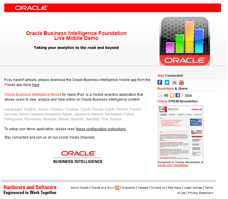
After you have provided this information, the next page is even simpler. It provides you with a link to the Apple iTunes App Store to download the Oracle BI Mobile app from. This is the link, in case you are wondering. The second is a link to a PDF that contains the configuration instructions.

Once you have the configuration entered in the BI Mobile app, you are all set.

Happy analyzing.

Links to download the Oracle BI Mobile App and Configuration Instructions


Customizable Wallpaper in the Oracle BI Mobile App

Thank you.
Abhinav
30 Aug, 2012
Bangalore

Thursday, August 23, 2012

Oracle Exalytics V1 Patch Set 1 is now GA

The Oracle Exalytics v1 Patch Set 1 is now generally available (GA). In fact, it has been available for a couple of weeks now. The update to Exalytics, the industry's first engineered in-memory analytics machine, delivers new capabilities, performance optimizations, Hyperion Planning, and Endeca Information Discovery.

This V1 Patch Set (v 1.0.0.1),  is recommended for all new and existing Exalytics customers.

So what's new in this update? Well, the software bits are new, as in updated. The three updated components of the Oracle Exalytics  v1 update are:
  • Oracle BI Enterprise Edition 11.1.1.6.2 BP1
  • Oracle TimesTen for Exalytics 11.2.2.3.0
  • Oracle Essbase 11.1.2.2.100
As you may be aware, the Oracle BI Enterprise Edition 11.1.1.6.2BP1 update provided several new capabilities across the board, the two biggest being enhancements in the area of visualizations and a revampled mobile app for the Apple iPad device. New Trellis visualizations - basically a grid of charts - that make it easy to visualize and understand massive data sets. When combined with the performance that Exalytics delivers, you get true speed-of-thought analysis. These Trellis visualizations support rendering data as new microcharts, like the SparkLine, SparkBar, and SparkArea microcharts. These are compact, cell-sized, data-dense visualizations and allow users to quickly discern the shapes and trends of data.

On the topic of in-memory analytics and performance, faster aggregate creation is now available, since both TimesTen and Oracle BI EE have been enhanced to enable faster data loads. Enhancements include parallel data load, index creation and disabling redo logging.

Separately, there there is a smaller footprint for TimesTen aggregates. The Oracle BI Server now generates a TimesTen optimized schema to significantly reduce the memory footprint used.

There is a Model Checker, faster query performance, and Faster aggregate recommendations.

With Oracle Enterprise Performance Management System Release 11.1.2.2, Oracle Hyperion Planning is supported on the Oracle Exalytics machine.

Oracle Endeca Information Discovery can now run on Exalytics with these versions:

  • Oracle Endeca Information Discovery 2.3.0
  • Oracle Endeca Server 7.3.2.

Then you also get Oracle Data Integrator certified to target TimesTen for Exalytics, and Oracle GoldenGate for TimesTen has been certified against TimesTen for Exalytics as a target.


And a bunch of other hardware related enhancements like Storage Area Network (SAN) Certification, and Auto Service Request (ASR) for Hard Drives.


Oracle Exalytics Documentation Library (link)

Thursday, August 16, 2012

Certification Matrix for 11.1.1.6.2BP1

The Oracle Fusion Middleware Supported System Configurations page has been updated with the "System Requirements and Supported Platforms for Oracle Business Intelligence Suite Enterprise Edition 11gR1" (aka SR&SP) for the 11.1.1.6.2BP1 release. It is available as a Microsoft Excel spreadsheet, and can be directly downloaded here.
Screenshot of SR SP Certification Matrix for Oracle BI

Wednesday, August 15, 2012

Updated BI Mobile App Available (11.1.1.6.2.1140)

An update to the Oracle BI Mobile App became available a few days ago (iTunes link). You would have spotted this update on your Apple iPad devices, by the badge on the App Store icon, and this would also have appeared as in the list of updates available for your iPad device.


So what's new and what's different in this release?
Well, first of all, before you get into that topic, a note on how to identify this update.
When we released the Oracle BI Mobile App for the BI EE 11.1.1.6.2BP1 release, it had a version number of 11.1.1.6.2.1080

This new app has is versioned 11.1.1.6.2.1140
The second way to identify this as an update is by the date. On the Oracle BI Mobile app's page on iTunes, you will see a date of Aug 11, 2012. That is less than a week old.
Updated Oracle BI Mobile app, version 11.1.1.6.2.1140, in App Store App

So what's new in this app?

Basically there are a few bug fixes. These bugs were identified late in the release cycle, and in one case, I think, after the app had been on the App Store. The decision was to put out an update to the app a few weeks hence.
Some of the issues fixed are:


  • Slider prompt values are correctly being displayed and changed as values are updated.
  • Highly dense trellis charts no longer intermittently display network time out errors. If an actual network timeout occurs, end users will be provided with the opportunity to reload the data.
  • Presentation Variables with default values are now being correctly displayed
  • Sliders with ordinal numbers will appropriately populate the to and from fields.


The update process is quite straightforward. Once you tap to install the updated app, it downloads and installs in about a minute or less.


After the installation has completed, you can start the app and either log in to any of the connections you have - all connection information is preserved, or go offline and check the "Version" information to verify that you are indeed, running the latest and greatest (and updated) version of the Oracle BI Mobile App.

In closing, here are a few useful links:

Updated: to add a link to the tweet announcing the updated app, and this post. Very recursive, all this.


Wednesday, August 08, 2012

New Oracle BI Book Due Shortly

Mark Rittman, longtime Oracle expert, consultant, and now soon-to-be author, tweeted that the book he has been working on for some time, Oracle Business Intelligence 11g Developers Guide, should be "out soon", now that it has completed edits and final proofs. It promises to be an interesting read, and given its scope of coverage, I expect it to find its place on many an Oracle BI developer's desk.

It doesn't look like the book will be available in an ebook format like the Kindle, which is a pity. A 900 page book would be much more convenient to carry in bits-and-bytes I expect.


Friday, August 03, 2012

Oracle BI Mobile at the Speed of Thought

There is a new video available on the Oracle web site that showcases the new Oracle BI Mobile application for the 11.1.1.6.2BP1 release.

Here is the link: http://medianetwork.oracle.com/video/player/1730810620001

This is a short three-minute video that takes you on a fast-tour of the new Oracle Business Intelligence Mobile app for the Oracle BI EE 11.1.1.6.2BP1 release. I have been blogging about this release and this app for the past couple of weeks, and this video, produced jointly by our marketing and product management teams, put together a very neat and informative tour of the capabilities in the app and the release.


There is a link provided in the video for more information. And you can always get the app from the Apple iTunes App Store, the software bits from either the Oracle Software Delivery Cloud or from the Oracle Technology Network (Note: you will need to get the 11.1.1.6.2BP1 patch from Oracle Support)

And as I blogged yesterday (I am in Bangalore, ergo), you could try the new version of the Sample App to give the new release a spin, courtesy a Virtual Box Virtual Image, with all the software and data installed and pre-configured. Plug-and-play comes to enterprise software samples!

All posts on the 11.1.1.6.2BP1 release.


Bangalore, August 3, 2012

Wednesday, August 01, 2012

BI EE SampleApp v207 (11.1.1.6.2 BP1) Available on OTN

The Sample App for Oracle BI EE has proven to be very popular and much appreciated by everyone - both within and outside Oracle.
An updated version of the Sample Application is now available for download from the Oracle Technology Network (OTN) here.

The Sample App has been updated, and is now available as a downloadable Virtual Box Virtual Image (VM). The VM has Oracle BI EE 11.1.1.6.2 BP1, Oracle Database 11.2.0.3.0 (with Apex, OLAP, ODM & ORE), Oracle TimesTen 11.2.2.3.0, Oracle Essbase 11.1.2.1, Oracle Internet Directory, and other Oracle software installed and configured.

What this means is this - download the Virtual Box image, deploy it, and you could be up and running in less than half an hour.

Sample App for Oracle BI EE page on OTN
It does not really get any simpler than this.

The downloadable image is approximately 22GB in size. In this day and age of 1 Terabit per second broadband and all, 22GB is a mere trifle.

Disclaimer:
The SampleApp contents and its example custom codes, including but not limited to, any example custom Java programs, JavaScript, SQL, SQL Loader Scripts, Shell Scripts, R Scripts and reports, are distributed free for demonstrative purposes only. It is neither maintained nor supported by Oracle as a licensed product. Oracle  specifically do not guarantee the accuracy of the results produced by any of these custom utilities. You must accept and comply with OTN License Agreement to use OBI EE SampleApp.

Oracle BI Mobile HD App - 2

Interactions
In my earlier post, Oracle BI Mobile HD App - 1, I started to talk about and show some of the capabilities of the recently released Oracle Business Intelligence Mobile app for the Apple iPad, as part of the Oracle BI EE 11g, version 11.1.1.6.2BP1 release. I blogged how you could download and install the app, and how the location intelligence feature works in it.

Continuing in that vein, I am going to take a closer look at some of the interactivity features available in this release.

Visualizations are an integral part of any analytics application. Visualizations are how data presentations best enable quick discovery of anomalies, trends, and areas for further investigation. Visualizations are what draw users to further explore data on a Dashboard. Yes, I know, I know. But the fact remains that a good visualization is well worth its wait in insight aurum. Tabular views have their own place in the scheme of things, but visualizations grounded in sound theory are what provide the quickest bang for the buck. In short, I seem to be saying visualizations, and good visualizations specifically, are the answer to global hunger. No, I am not, but within the context of data analysis I would venture and say a good visualization is worth a thousand insights.

Oracle BI EE offers a rich palette of visualizations from which to construct Analyses and Dashboards. For facilitating detailed inspection of data you have the table view. For a multi-dimensional yet detailed look at data, there is the Pivot View. Charts offer the convenience of being able to provide high-level overview of data, with the option of drilling down for viewing trends and data at a more granular level, while tooltips offer the convenience of providing specific, accurate values of data, while at the same time not adding unneeded artifacts to the visualization (a double-negative is a no-no in writing, but I don't lay any claims to literary aspirations).

Coming to the specific topic of visualizations like graphs, and how to interact with them on tablets like the iPad, let's take a look at two topics. The first is "tooltips" and the second is interactions. Actually, both are interactions, but you will see what I mean in just a bit.

As I mentioned earlier, charts are very useful because they provide a great way to take-in all the data being displayed in one glance, without being overwhelmed with the details. Put another way, you want to make use of your pre-attentive processing skills here. Look at a chart and without consciously making an effort, get a general "sense" of the data displayed. After that, you can start exploring. Exploration usually begins with a simple gesture, a simple action like invoking a tooltip. On the traditional desktop browser this easy enough to do - you move your mouse over the concerned series, and a tooltip pops-up with the relevant information. Secondly, when using a mouse, you have much greater control over the preciseness of movement and therefore, even with small charts where data is densely packed, you do not experience usability issues.

Not so much the case with touch devices. On touch devices, you do not get a tooltip via a hover gesture. In fact, several design guides for touch computing proscribe using hover gestures, which makes sense. At least for now, no hover gesture is workable on tablets - you cannot really place your finger a teeny weeny millimeter over the tablet and expect a hover tooltip to materialize. At least, not yet. On the other hand, people using traditional computer interfaces that support a mouse have become very used to hover gestures providing context and additional information - the hover tooltip is a great aid in discoverability. Some may argue that a hover gesture should not be required, and when relied upon is often an indication of a poor design. There may well be a smidgeon of truth in that, but the fact remains that the hover gesture can greatly reduce unintended clicks.

On touch devices, you have to tap to get a tooltip, or invoke whatever action has been defined on the item being tapped. The second issue is that preciseness of touch does not match that of a mouse on a computer. Doesn't even come close. So when you tap on an item, it is not guaranteed that you will in fact end up tapping that intended item. Apple says as much, which is why their design guidelines call for a minimum dimension for buttons and tap targets. However, when you are dealing with dynamic views like charts, where you could get as few as four values at one level of a hierarchy, and drilling down could result in tens, even hundreds of values, this can be a problem. For instance, at the region level, my chart may show only six countries for South Asia - India, Pakistan, Bangladesh, Nepal, Sri Lanka, and Bhutan. Drill down India, and I could end up with over 600 items, if my next level in the hierarchy is showing data at the "district" level. A problem. On the browser interface of Oracle BI EE, this is not really a problem, because the "zoom-and-scroll" feature on graphs is intended to address precisely this issue.

So how does the Oracle BI Mobile app handle this problem? By supporting touch gestures.


That's it? No more details?
Yes, yes, details, details, details.
What are the most popular and useful charts? The bar? Yes. Vertical bar chart? Yes. Stacked Vertical Bar? Yes. Horizontal Bar? Yes. Stacked Horizontal Bar? Yes. Line? Yes. Basically, let's take a look at what I consider the most popular and perhaps even the most useful of charts, the bar chart. The good old bar chart. The much abused bar chart.

Consider the screenshot below, and notice the stacked vertical bar chart displayed in the bottom left corner of the screen. Here I am plotting "Revenue" data at the grain of "Month" and "Brand". This means, that my series is by "Month", i.e. the X-axis is plotting data by month. My grouping of data is by "Brand", i.e. within each month, I have grouped my data by "brand". Each stacked bar for each month represents Revenue data in a given month for a given brand.

If I need to interact with this data, I need to be able to tap on any bar and get a tooltip. The tooltip would then provide me with information about the item tapped, but also let me initiate an action on the item. The action could be "nothing" - as in the report author did not provide any interaction that could be performed on the item, "drill" - as in drill down the item tapped, "actions" - as in invoke the Action defined on the item or display a menu of Actions available for the item, and "send master-detail event" - as in send a master-detail event on the channel specified in the analysis.

To get a tooltip, tap on the bar. A color-coded tooltip is displayed. What this means is that the leader line of the tooltip as well as the border color of the tooltip is the same color as the bar you tapped. Helps, doesn't it.


But what if you did not intend to tap on the bar for the "HomeView" brand? That's ok, because you can drag the tooltip. Drag, did I say? Yes, Tap anywhere in the tooltip, except on the button, and drag the tooltip down, or up. If you drag it down, the tooltip will snap to the next item in the series, and update to display you data for the "FunProd" brand. And you can see that the color of the leader and the border of the tooltip changes. Drag up, drag down.


Repeat it and drag the tooltip all the way down, to the first brand, "BizTech"

So this is how you can tap and drag the tooltip within a series. But what if you want to drag it across a series. I.e. you want to see data for a selected brand across all the months that you have displayed on the chart? Yes, of course, be my guest. Tap and you get a tooltip. Now tap-and-drag this tooltip across the chart, and the tooltip merrily accompanies your drag gesture, the information inside the tooltip changing as you move from one bar to the other.
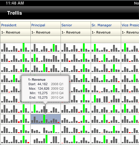
Now, these tooltip gestures are not limited to standalone charts. These are also available in the Trellis view. The new kid on the visualizations block in this release. Specifically, the tap-and-drag gesture is available in the Simple Trellis. What is a Simple Trellis? It is a Trellis visualization that supports one visualization across the entire Trellis. And we will talk about that in a future post. As the next two screenshots illustrate, you can tap inside a cell in the Trellis grid to get a tooltip, and then drag this tooltip within the cell.


What about the Advanced Trellis and tooltips and gestures? First, what is an Advanced Trellis? An Advanced Trellis is a Trellis view that supports multiple visualizations; i.e. a different visualization per measure. And we will talk about this in a later post. An Advanced Trellis also makes use of microcharts, like the SparkBar, SparkLine, SparkArea - which means that they are even more suited to visualizing large amounts of data - literally thousands of data points in a Single Trellis view, hundreds in each cell. In spark visualizations, the intent is to discern the overall trend and shape of the data in a cell, and not so much on the individual values. Therefore, what is most appropriate for a cell in an Advanced Trellis is to provide a summary of the data - the measure name, the initial or starting value, the last or end value, and the minimum and maximum values.


I really want to get this post, err... posted, so I am excluding other interactions on graph views that I wanted to talk about from this post, and will include them in a subsequent post.

Thank you.

Abhinav Agarwal,
Bangalore, August 01, 2012

Thursday, July 26, 2012

Oracle BI Mobile HD App - 1

As usual, and unsurprisingly, I am late with my promised follow-up post on the latest Oracle BI EE release, version 11.1.1.6.2BP1.

I wanted to, still want to, and hopefully will do, a series of short posts on the new release, focusing on a few areas, and leaving out others.

The three areas I hope to focus on in the first pass are the new mobile app, geo-spatial visualizations, and some exciting new data visualizations.

Starting with the first one, the Oracle BI Mobile app.

This, Oracle Business Intelligence Mobile HD, is a new app that Oracle released along with the server software, version 11.1.1.6.2BP1, and the app has been available on the Apple iTunes App Store for a little over a month now. As an aside, I must say we were very pleased with the hassle-free and lightning quick review and approval process from Apple. Not that one would expect anything different.

So, where can you get the new app from? I think I just answered that, i.e. from the Apple iTunes App Store. But I do apologize. Let me elaborate.

As you would expect, there are two ways to get the app. Three, if you are an Oracle employee, but let's just keep the post focused on the general public.

Before I start, here is the link to the app's page: http://itunes.apple.com/us/app/oracle-business-intelligence/id534035015?ls=1&mt=8

If browsing from your computer, you can launch the iTunes application. From there, you can either browse to the Business apps category, or directly search for the app by typing "Oracle" or "Oracle BI" as your keywords. Either will do just fine. Note here that you are going to get TWO results for the Oracle BI Mobile app. Yes. Nice, isn't it? Choice is always a good thing. So what's up with the choice here? If you are running the latest and greatest version of Oracle BI, 11.1.1.6.2BP1, then you should, no - you must, use the "Oracle BI Mobile HD" app. That's because this app has some very, very nice features, and also because, and this is where things get serious, this app will connect only to the latest version of Oracle BI EE, viz. 11.1.1.6.2BP1.

The new Oracle BI Mobile HD app,version 11.1.1.6.2BP1.

At this point, you may have a question. Even if you don't, I think I am going to ask a rhetorical question and answer it, even though rhetorical questions are not meant to be answered. What if I have the 11.1.1.5.0 version of the BI Mobile app installed on my iPad, and what if I want to connect to Oracle BI EE, 11.1.1.6.2BP1? Well, nothing to fear. The app will connect just fine. You will, of course, not get the really nice stuff that the new Oracle BI Mobile app has, but if you do not want to try out the new app just yet, that's ok then.

So, to return the narrative to the new app, what's the other way you can get the app? Over the air, that's how. From your iPad, you can launch iTunes, and from there locate the Oracle BI Mobile HD app, tap to install it, and you are on your way. This app is about 9MB in size, so the download should be done before you can say, "that was fast." No, really. Try it. 

Oh, by the way, as an aside, I remember a discussion with our product development team in 2010, when we were working on the earlier BI Mobile app (version 11.1.1.5.0). There was a concern about keeping the size of the app down, because an app that was 10, 20MB, or larger in size could have deterred some from downloading the app. So went the thinking. I read an article on the web a few days back that mentioned some gaming apps that are more than 1GB in size! Times change. And fast. And how! Anyway, a 10MB app is a mere trifle. On a device running on an LTE network this should take a few seconds.


iTunes page for Oracle BI Mobile HD App on iTunes
The install process is also very, very quick.

Oracle BI Mobile HD App downloading on an iPad
After the app has installed, the next step is to launch it. Well, before that, some people like to have things arranged neatly. If you want to do that, if you want to move the Oracle BI Mobile HD to the page that you have reserved for all the other, nice Oracle apps, then you go ahead and do just that. After you have done that bit of rearranging, tap to launch the app. Now, since this is going to be the first time you would be starting the app, there is a bit of legalese that needs to be cleared off first. It is the "End User License Agreement", and you, as the end-user, need to accept it. Swipe to scroll to the bottom, click tap "Accept", and that's the last time you will see that screen, I think.


After that you see a screen that allows you to do three things. You can either connect, if you have a connection to a BI Server defined. You can stay offline. Or you can add one or more connections. Since this is the first time you are using the app, you will not have any connections defined and available. Since this is the first time you are using the app, you will also not have any offline content to peruse. Therefore, it behooves us to define a new connection. The new connection screen is the same as before. I.e., the same as in the 11.1.1.5.0 BI Mobile app. You need to provide a name to the connection, a useful and descriptive name perhaps. The hostname, port, and other details.
If the URL you use to connect to BI on your browser looks like https://oraclebiee.mycompany.com:9704/analytics, then  oraclebiee.mycompany.com  is your host9704  is your port, the SSL option should be ON. If you are using Single Sign-On, like Oracle Access Manager, then you should check the SSO option to "ON". Else, you need to enter a username and password in their respective fields. Actually, hold that thought. You can leave the "Password" field blank, and you will be prompted for the password when you try to connect to Oracle BI EE using this connection.

There you go.
Actually, is there an easier way to define a connection? I mean, typing in hostnames and port numbers is not exactly fun, is it? No. It is not. So, is there an easier way? Yes, there is.
...
...
Well Abhinav, are you going to talk about it, or should we use transcendental meditation to divine it from you? No, no, I apologize. That is a topic for a later post, but trust me, there's an easier way to create these connections.

Ok, so we still have not seen a screen with BI on it. Yes, you haven't. And just bear with me a little while longer.
If you do not like the background wallpaper on the app, you can change it. If you tap the "Wallpaper" option from the "Settings" panel, you can select from three pre-shipped screens that come with the app. I personally prefer the dark, black-ish wallpaper, but there is a blue and green wallpaper also available. Go ahead, add some color to your analytics app.


Once you have defined these connections, one or more, you would also have set one as your default connection. Actually, when you added your first BI connection, that got set as your default connection, as evidenced by the little green checkmark against the connection name in the "Settings" panel. You can change the default connection to any other by simply tapping any other connection's row.

From the app, if you tap the "Options" menu, the second choice says "Login (....)". This is your default connection. Tap it to connect to a BI Server.


The very first time you connect to a particular BI Server from your app, you will see a cute little progress bar that says, "Downloading one-time application resources". This basically means that the app is downloading some static files that are used by BI content. Things such as CSS files, JavaScript files, and image files that are used by the app. These are not data-related files, but files used to render content correctly and to also allow for interactions on the content. Ergo, a one-time download.


Once connected, you will notice a few things. Or at least, you should. Firstly, you will notice these big, large placeholder images, arranged and presented as a carousel view. Use a single-finger swipe gesture to scroll through this carousel, and to view all the views in this list. This list could show Analyses, Dashboards, Reports, Scorecards, and more. If you do not like the carousel view, tap the icon, the on the right, on the row that reads "Recent". Yes, that one. Tap it and the view changes to a more traditional list view. Tap it again and it switches to a carousel view. The button is therefore a toggle button - it toggles the display of your most

Carousel View


List View
Before finishing up this post, I want to provide a short view into one specific feature, which is the location intelligence capability. With the 11.1.1.6.2BP release, the Oracle BI Mobile app is now able to take advantage of your location. Basically, this feature consists of two parts. The first one is determining your location. The other part involves placing a pushpin on that location and zooming the map view to your location.
As you can see from this screenshot below, the first time you use this feature, you will be asked to provide permission for the app to get your current location.

After you allow the BI Mobile app to get your location, you will see an orange pushpin placed on your current location. The map also zooms in, not quite to the street level, but somewhat in-between the street and city level.


To dismiss the location pushpin, tap the pushpin, and then tap "Remove Marker".


On to writing the next post in this series. Hopefully, fingers crossed and all, sooner than later.
Note: I am posting this in some haste, so I may come back and make some revisions.

Monday, July 02, 2012

Documentation for BI EE 11.1.1.6.2BP1

Shortly after posting my earlier post, announcing the availability of the Oracle Business Intelligence 11.1.1.6.2BP1 patchset, I realized I had missed out a couple of other pieces of information that would be immediately useful.

These two items are the certifications information and the documentation library.

The documentation library for this release is available at Business Intelligence Documentation for Oracle Fusion Middleware 11g (11.1.1.6)
Within this documentation library, there are a couple of points worth noting.

The first is that there is a new doc for Oracle Business Intelligence Mobile. It is available at Oracle® Fusion Middleware User's Guide for Oracle Business Intelligence Mobile 11g Release 1 (11.1.1) - Contents and it has PDFMobi, and ePub versions also available. So now you can not only download the PDF version, but also download an eBook reader-friendly version like .mobi and .epub.

For a list of new user features in this release, take a look at the New Features for Oracle Business Intelligence Users - 11g Release 1 (11.1.1) chapter from the User's Guide for Oracle Business Intelligence Enterprise Edition doc.

The OTN page for Middleware certifications should be updated with the BI EE 11.1.1.6.2BP1 certifications information soon I expect.
I will post an update once that is available.