Finally got around to writing my long overdue post on the new BI Mobile HD app. To get on with it, without much ado, not to loiter, and all that... here goes.
 The new BI Mobile HD app, version 11.1.1.7.0.2094, can be downloaded from the Apple iTunes App Store (link to app preview page on iTunes).
If you already have the BI Mobile HD app installed on your iOS device, you should get an App Store notification on the availability of an upgrade. Note, that since this version is available only for iOS version 6 (and above), if you are running an older version of iOS, you will not get a notification, and will not be able to download it. If you check the Wikipedia iPhone page (link) you will see that the iPhone 3GS and later devices support iOS 6. As far as the iPad device goes, if you check the Wikipedia page (link), iPad 2 and later devices support iOS 6.
 If you search for it from your supported iOS device, you will find it as the second result. The first is also an Oracle BI app - the Oracle Business Intelligence Mobile app, but that is for OBIEE version 11.1.1.5. The BI Mobile HD app is now a Universal app, and is therefore available on both smartphones and tablets. I will follow up with a post on the iPhone version later (yes, I will). Downloading and installing is a straightforward process. Tap to install. The app size is 16.1MB, and once downloaded, takes a few seconds to install.
The single biggest change you will see out of the box once the app launches is the presence of a "demo" server connection. So you can run the app without having to configure a connection. Which is very convenient. Tap to select it and the app will connect to this "OBI Mobile Public Demo Server". This server runs on the Oracle Cloud, and therefore accessible from the public Internet.

The second change is that you have a help screen to, err, help, first-time users get familiar with the interface and controls of the app. While the user interface is simple and intuitive, this screen does a good job of summarizing the different ways you can launch and navigate to the different parts of the app.

Yes, landscape and portrait orientations are well and truly supported, so flip your device this way and then that.

The other point to note is that the panel of menu navigation tabs (check this post on the first iteration of the HD app last year) at the bottom of the app - "Recent", "Favorites", "Dashboards", "Local", and "Search" - have been replaced by a slide-out navigation bar. Also, you can access the "Settings" screen by swiping right.

 So, if you do launch the "Settings" screen, you will notice several new things. The first is that you can now choose where in the App to begin when you launch it - in the "Recent" tab, or the "Favorites" tab, etc... The second is that you can also choose how your content preview thumbnails should be displayed. That is, apart from the "List" and "Carousel" options that have existed, a third option - "Grid" - has been added. For what it's worth, I find that the grid layout presents more data - especially if you have the preview thumbnails generated for the content.


Inside your content, you will notice that the Dashboard Page dropdown has been replaced by a touch-enabled flat list. You can tap any page title to switch to that dashboard page, but also swipe left or right to view other pages - if there are more pages than can be displayed at the same time. The current dashboard page is indicated by a blue color for the page and a subtle arrowhead below the page.

 Coming back to the Settings screen, it is now easier to select a wallpaper - simply tap and the wallpaper is selected and immediately applied. You can see how the wallpaper looks like from within the Settings screen.
Then there is the option to select which screen you begin on - that I covered above. The option to select the format in which attachments are created when you email content from within the app lets you select three options - no attachment (i.e. only a link is included in the body of the email), HTML, and PDF.
The last row shows you your server connections, the first one being the demo server connection - that you cannot edit, and the remaining are connections you've defined.


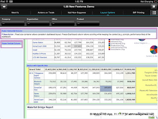
New functionality introduced in the 11.1.1.7 release, including fixed headers and fixed sized dashboard sections work on the HD app also. So you can use the tap-and-drag gesture to move content within fixed sections, as well as scroll through content for views with fixed headers. Oh, and by the by, the double-tap gesture now works to maximize most views (not sure which it does not maximize for, but works for most of the views).
 Another new enhancement (enhancements are by their nature "new", so here's an example of a tautology) introduced in the 11.1.1.7.0 release of OBIEE was support for Map Views as detail views in master-detail linking. This support is not the full-blown detail support that is available for other views, and I will elaborate in a separate post, but basically you can now set up Map Views to listen to master-detail events on a specified channel. So, if you were to tap on the axis label in the bar graph on the left, on say, "USA", then the bar graph on the right and the map view both respond to that event. In the case of the map view, it zooms in and redraws itself based on the bounding rectangle for the USA.
And for Brazil, and so on...


And this is an example of a Map View with a bubble (proportional symbol) format with a feature theme underlain - the feature theme is based on a metric at the county level, and thus you have more than three thousand color-coded polygons.

A similar example, but this time with an image format with a heatmap format based feature theme. The heatmap format is based on district population figures.
 And finally, an example from the Airlines data sample app with airline routes plotted as line formats. The lines in a Map View can be color-coded based on a measure and their size varied on a second measure. This is very much similar to how proportional symbol formats in Map Views have also worked since 2010.


And this is an example of such a proportional color-coded line format. You can tap on destination and origin airports to get a popup of the selected metric, and then use the underlying feature-theme based color format for additional context.


Abhinav,
Bangalore, Sep 26 2013
 The new BI Mobile HD app, version 11.1.1.7.0.2094, can be downloaded from the Apple iTunes App Store (link to app preview page on iTunes).
If you already have the BI Mobile HD app installed on your iOS device, you should get an App Store notification on the availability of an upgrade. Note, that since this version is available only for iOS version 6 (and above), if you are running an older version of iOS, you will not get a notification, and will not be able to download it. If you check the Wikipedia iPhone page (link) you will see that the iPhone 3GS and later devices support iOS 6. As far as the iPad device goes, if you check the Wikipedia page (link), iPad 2 and later devices support iOS 6.
 If you search for it from your supported iOS device, you will find it as the second result. The first is also an Oracle BI app - the Oracle Business Intelligence Mobile app, but that is for OBIEE version 11.1.1.5. The BI Mobile HD app is now a Universal app, and is therefore available on both smartphones and tablets. I will follow up with a post on the iPhone version later (yes, I will). Downloading and installing is a straightforward process. Tap to install. The app size is 16.1MB, and once downloaded, takes a few seconds to install.
The single biggest change you will see out of the box once the app launches is the presence of a "demo" server connection. So you can run the app without having to configure a connection. Which is very convenient. Tap to select it and the app will connect to this "OBI Mobile Public Demo Server". This server runs on the Oracle Cloud, and therefore accessible from the public Internet.

The second change is that you have a help screen to, err, help, first-time users get familiar with the interface and controls of the app. While the user interface is simple and intuitive, this screen does a good job of summarizing the different ways you can launch and navigate to the different parts of the app.

Yes, landscape and portrait orientations are well and truly supported, so flip your device this way and then that.

The other point to note is that the panel of menu navigation tabs (check this post on the first iteration of the HD app last year) at the bottom of the app - "Recent", "Favorites", "Dashboards", "Local", and "Search" - have been replaced by a slide-out navigation bar. Also, you can access the "Settings" screen by swiping right.

 So, if you do launch the "Settings" screen, you will notice several new things. The first is that you can now choose where in the App to begin when you launch it - in the "Recent" tab, or the "Favorites" tab, etc... The second is that you can also choose how your content preview thumbnails should be displayed. That is, apart from the "List" and "Carousel" options that have existed, a third option - "Grid" - has been added. For what it's worth, I find that the grid layout presents more data - especially if you have the preview thumbnails generated for the content.
The carousel view continues to be useful to see which content you have accessed most recently, placing it front-and-center on your app. The swipe gesture works as before for navigating through the carousel.

Inside your content, you will notice that the Dashboard Page dropdown has been replaced by a touch-enabled flat list. You can tap any page title to switch to that dashboard page, but also swipe left or right to view other pages - if there are more pages than can be displayed at the same time. The current dashboard page is indicated by a blue color for the page and a subtle arrowhead below the page.

 Coming back to the Settings screen, it is now easier to select a wallpaper - simply tap and the wallpaper is selected and immediately applied. You can see how the wallpaper looks like from within the Settings screen.
Then there is the option to select which screen you begin on - that I covered above. The option to select the format in which attachments are created when you email content from within the app lets you select three options - no attachment (i.e. only a link is included in the body of the email), HTML, and PDF.
The last row shows you your server connections, the first one being the demo server connection - that you cannot edit, and the remaining are connections you've defined.


New functionality introduced in the 11.1.1.7 release, including fixed headers and fixed sized dashboard sections work on the HD app also. So you can use the tap-and-drag gesture to move content within fixed sections, as well as scroll through content for views with fixed headers. Oh, and by the by, the double-tap gesture now works to maximize most views (not sure which it does not maximize for, but works for most of the views).

 Another new enhancement (enhancements are by their nature "new", so here's an example of a tautology) introduced in the 11.1.1.7.0 release of OBIEE was support for Map Views as detail views in master-detail linking. This support is not the full-blown detail support that is available for other views, and I will elaborate in a separate post, but basically you can now set up Map Views to listen to master-detail events on a specified channel. So, if you were to tap on the axis label in the bar graph on the left, on say, "USA", then the bar graph on the right and the map view both respond to that event. In the case of the map view, it zooms in and redraws itself based on the bounding rectangle for the USA.
And for Brazil, and so on...

The double-tap to maximize gesture that I talked about -


And this is an example of a Map View with a bubble (proportional symbol) format with a feature theme underlain - the feature theme is based on a metric at the county level, and thus you have more than three thousand color-coded polygons.

A similar example, but this time with an image format with a heatmap format based feature theme. The heatmap format is based on district population figures.


And this is an example of such a proportional color-coded line format. You can tap on destination and origin airports to get a popup of the selected metric, and then use the underlying feature-theme based color format for additional context.


Abhinav,
Bangalore, Sep 26 2013