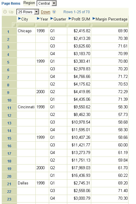
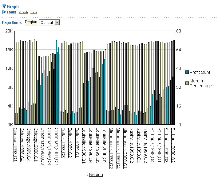
Take for example the table below. It displays Profit and Margin data for Cities, Year, and Quarter, by Region. For the given dataset this query returns 70 rows. Even though I have 25 rows of data displayed the bar graph shown below is plotting data for all 70 rows.
As you can see the graph looks crowded. I could change it to an area graph or a line graph to improve its appearance, or I could increase the plot area of the graph, but there is a third alternative.
 First, I want to reduce the number of rows of data I see in my table itself. Since I have 10 quarters worth of data for every city, I have set the number of rows I want to see at a time to 10.
The second, and more important change I make is this: expand the 'Tools' toolbar of the graph, and you will notice two radio group options. The first one, 'All data', is the default option. The second option, 'Displayed data', is what I am interested in. I check this option and click 'Go'.
 The graph now plots data only for those rows that are actually displayed in the table in Viewer, not for all the data.
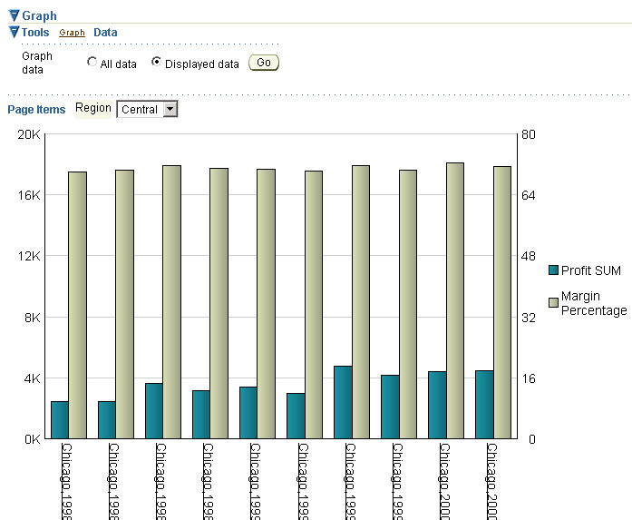
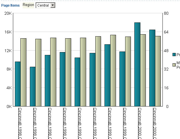
If I were to page to the next 10 rows of data in the table above, the subset of data graphed changes from 'Chicago' to 'Cincinnati'.
Nice, isn't it?
A brief footnote: sometime in July 2003 our Viewer expert had prototyped this and asked for inputs on the suitablity of including this in the final product. My feedback was, "I think it is great!"