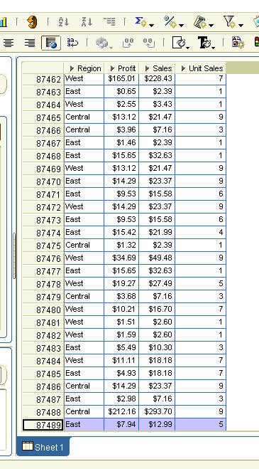
Take the screenshot below. It is a table. It shows Profit, Sales, and Unit Sales data at the detail level. I.e. it shows data at the transactional level. I have included only the 'Region' level of the geography dimension. There are only three regions in my data set: East, Central, and West. Which is why these members repeat many, many times. But each row represents a transaction. And I have more than 87,000 transactions. This is a lot of data. You can imagine the excitement if this were to be a few million, billion rows. How do you make sense of this data? Or more precisely, how do you start to make sense of this data?
 One way to do is to summarize this data. And if you are using Discoverer, you can summarize this data in about three clicks . How? Simple. From your menu click the arrow to the right of the 'Add Worksheet' icon (that would be the sixth icon in the Discoverer toolbar).
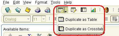 Or you could use the menu and select 'Edit' >> 'Duplicate Worksheet' >> 'As Crosstab'.
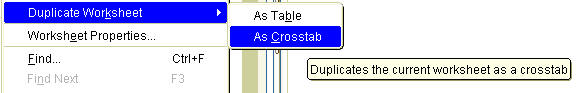
Up pops a screen where you can adjust the layout of your crosstab.
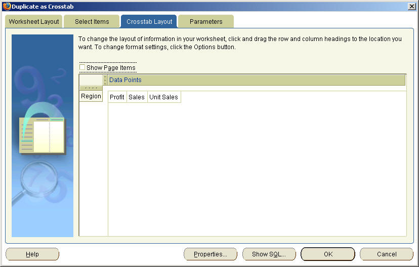 Click the 'OK' button and there you go! Nine cells of data. Profit, Sales, and Unit Sales have been summarized for each of the three regions.
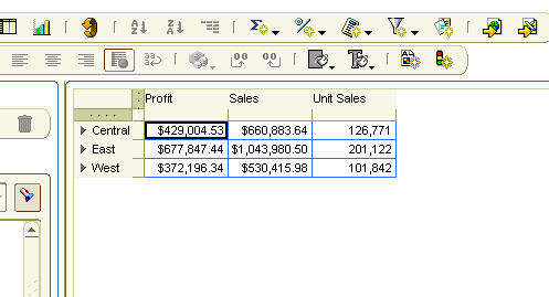 Simple, yet powerful (or is it powerful, yet simple?). Discoverer has had this capability for many, many releases now. Yet, as I read and scout the web for news and views, I hear that there are vendors that are aiming to bring out similar functionality only next year, or the year after next. How original.