Pages

Tuesday, August 17, 2010

OBIEE 11g - Flash Player 10.1 required

To display graphs as Flash objects in your browser, you need to have Adobe Flash version 10.1 running.
If you do not have this version, what you will see when you open up a Dashboard page or Analysis containing graphs will be something like this:

Dashboard page with graphs not displaying

So, you need to upgrade to Flash Player version 10.1 or install it if you don't have any version of the Flash Player installed.


Browse to http://www.adobe.com/software/flash/about/ and you will be able to see which version of the Flash Player you have installed.
Adobe Flash Player Information Page

To download and install the latest version, 10.1, browse to http://get.adobe.com/flashplayer/

From there, download and install the Flash Player.


After the installation completes, reload your Dashboard page, and the graphs should display correctly now.
Dashboard page with graphs displaying in the Flash format

To read the release note that describes this issue, you can go to the Oracle® Fusion Middleware Release Notes, 11g Release 1 (11.1.1) for Microsoft Windows (32-Bit), Part Number E10132-16 and click on the chapter for Oracle Business Intelligence

This is the release note section:

53.1.3 Adobe Flash Player Version 10.1 or Above Required to View Graphs and Scorecards

The Adobe Flash Player is a cross-platform browser-based application runtime and is required for rendering graphs and scorecard objects in your browser.
Users must have Adobe Flash Player version 10.1 or above installed on their browsers in order to correctly view all graphs and scorecards generated by Oracle BI EE. Users can obtain information about the version of the Adobe Flash Player running on their browser by going to http://www.adobe.com/software/flash/about/.

Monday, August 16, 2010

Geo Raster Map in OBIEE 11g

Screenshots from an Oracle BI EE 11g analysis.
Noteworthy:
This analysis contains a Map View. Two in fact. But the biggest one is one displaying geo-raster imagery (popularly known as the "Satellite View"), with the raster data stored and fetched from an Oracle Database. The tiles have been generated and rendered by Oracle MapViewer.
Also note the fact that you can choose to show or hide the different formats visible in the formats panel.


I shall be writing extensively about these capabilities in the OBIEE 11g suite in the coming weeks.
Watch this space.

OBIEE 11g Certification Matrix

The download page for Oracle Business Intelligence Enterprise Edition 11g also contains a link to the OBIEE 11g Certification Matrix (Excel file)  - be sure to take a look at it as it contains a lot of useful information like the operating systems supported, and versions supported for JDK, Oracle Database, Oracle Fusion Middleware, Oracle e-Business Suite, PeopleSoft, JD Edwards, Retek, non Oracle Databases, non Oracle identity management suites, language support, etc...
See also my earlier post: OBIEE 11g Available for Download
 

OBIEE 11g Available for Download

The Oracle BI EE 11g Launch Event announced to the whole wide world the latest and most substantial BI release that Oracle has done, and indeed the most important BI release the industry has seen. Now that software is available for download.

If you go to the BI downloads page on OTN (Oracle Technology Network), you will find two links - one for 11g and the other for 10g. Click the 11g link, which takes you to the download page for 11g. You have to accept the "OTN License Agreement" before you can download the software. You can download the software for Windows x86 for 32 and 64-bit platforms, and for Linux x86, also in 32 and 64-bit platforms. There are four files to be downloaded, in all a little more than 4GB.

Happy downloading and welcome to Oracle BI EE 11g.

OTN Page for Oracle Business Intelligence Downloads

Download page for Oracle Business Intelligence 11g, version 11.1.1.3.0

Wednesday, July 14, 2010

OBIEE 11g Released

Oracle had a launch event last week, on the 7th of July, when it announced the latest release of Oracle Business Intelligence, 11gR1. Check out the launch page at http://www.oracle.com/businessintelligence11g

Over the next several weeks, I will be posting about the products and features that I am responsible for, as well as about some of the other areas in the product that are notable and new.

Wednesday, February 17, 2010

Junk Viz - the 100 slice pie chart

As junk visualizations go, while there has been enough that has been written on the drawbacks with the pie chart, this example below, from 10 Ways to Archive Your Tweets, brings out the problem in a most, shall we say, visual manner.

As far as gleaning any information from this chart goes, it's a lost cause. You would need to possess incredibly powers of being able to precisely position your mouse over a particular slice to see its value. If, on the other hand, you decided to go down the legend, see a name, and then go to the pie chart to figure out the value of the slice, there are so many colors in use that the entire exercise would be reduced to an almost futile case of trial and error.

So what in its place? A simple table would have sufficed. With perhaps an underlying data bar on the cells. You could conditionally format the table so as to color code the rows in deciles, or quartiles.

Or you could slice the data by deciles, and place a dropdown above the table so that only ten rows at a time were displayed.

Or you could display only the top 10 and the bottom 10 tweeters by default, and provide the user with an option to expand the middle 80 rows of the table.

Or almost anything else. But this pie chart.

Monday, February 15, 2010

Gartner Magic Quadrant for Business Intelligence Platforms, 2010

In my last post, Gartner Magic Quadrant for BI Platforms 2010, I wrote that Oracle had been positioned in the 'Leaders' quadrant, for the fourth year in a row.

The link to the Gartner Research Note is now available, on the Gartner site, at Magic Quadrant for Business Intelligence Platforms

Thursday, February 04, 2010

Gartner Magic Quadrant for BI Platforms 2010

Analyst firm Gartner published its Magic Quadrant for Business Intelligence Platforms for 2010 (Gartner RAS Core Research Note G00173700) last week. The full report can be accessed on Gartner's web site here.

Some salient points from the research note:
  • Oracle has been positioned in the Leaders Quadrant.
  • Oracle has established the Oracle BI Enterprise Edition (OBIEE) platform as the "BI standard" in 82% of the references that responded to our Magic Quadrant survey. It also has the widest range of BI platform capabilities employed (for example, reporting, dashboards, ad hoc query).
  • Oracle was one of the top three vendors for product quality.
 

Wednesday, November 25, 2009

Visualizations - The Pie Chart

The Telecom Regulatory Authority of India (TRAI) put up a press release, Date: November 21, 2009 Press Release:Telecom subscribers growth for the month of October 2009. ,  that has information on the telecom subscription data in India for the month of October 2009. Apart from the quite amazing piece of news that India added 16.67 million (that is 16,670,000) new wireless subscribers, and that the total telephone subscriber base now stands at 525.65 million (that is more than half a billion), the notable thing as far as this blog post is concerned is that depressing use of visualizations in the note.


A few things are obvious at first glance:
- It is a pie chart with a 3D effect.
- This is an Excel generated chart.
- There is redundancy in the chart: the slice labels contain the operator name, and then the legend at the bottom repeats the same information.
- The data is not sorted, so even if you could somehow compare these 3D slices, you would have a tough time finding which is the largest slice, which is the second largest slice, and so on.
- To find the largest slice, you are better off simply comparing the numbers. Which makes the chart itself quite unnecessary.
- The color scheme is very Excel-ish, which is to say, quite unpleasing to the eye. Excel 2007 is an improvement, for sure.
- There are black borders around the slices, which do not make the chart any better.
How to improve this?
Here are some examples:

Example 1:
You cannot really go wrong with a bar chart. This bar chart displays the same data, except now as a bar chart. Straight off you can tell from a visual inspection that "Tata" added the most subscribers, close to 25% of the net additions in October 2009.


Example 2:
I have now added data labels at the top of each bar. This makes it possible to see the precise values for each operator.


Example 3:
By now, it is clear that sorting the bars would make the data a lot more easily digestable. So what insights are now possible with this example? For one, that Reliance and Aircel and even Idea are two operators that added almost the same number of subscribers. Not very obvious from the above examples. Aircel is a relatively new operator, but seems to be growing quite fast, thanks to its aggressive advertising.


Second Chart:


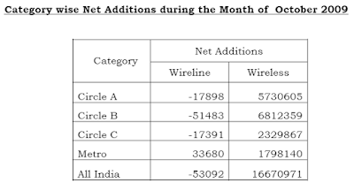
This table above shows "Category wise Net Additions during the Month of October 2009'.
Notwithstanding the fact that the data here would be a lot more easy to understand if it had been formatted with commas, let us see how it may be visualized as a chart:

This chart does one thing well. It gives a sense of the difference in scale between the wireline and wireless segments. The wireless segment is growing by millions, in every circle, while the wireline segment is in decline. The decline is however minuscule. And without labels, it is difficult to gauge even the approximate values.

So, if I plot this now as a percent stacked bar chart, it looks like an improvement. What I have done is added labels to each stack. I can now see that the Metro segment showed a rise, while the other three segments showed a decline in the wireless segments.
However, this chart is sort of misleading, because it makes the wireline and wireless segments appear equal. Which, as we saw, is most certainly not the case.


As the third example, I have now plotted the same data as a stacked vertical bar chart. Not as a percent stacked chart, but simply taken the absolute values and stacked them.

The vertical chart brings out quite nicely the difference in magnitude between the wireline and wireless segments.
A problem existed for this chart also. Which is that the categories for the wireline segment are so small, that the individual stacks are barely visible, even on a chart as tall as this one. So, I have added data labels, and then manually moved the labels so that they don't overlap.

Friday, November 20, 2009

Deploying OBIEE on Sun

This post is not exactly fresh on the heels of Oracle OpenWorld (OOW), but one presentation of note was OBIEE in a High Availability (HA) environment.

The document DEPLOYING ORACLE® BUSINESS INTELLIGENCE ENTERPRISE EDITION
ON SUN SYSTEMS
was instrumental in getting to HA.

Enterprise Deployment of Oracle BI EE on OC4J and App Servers

There have been questions in regards to OC4J vs a "full" Application Server when in use with Oracle Business Intelligence Enterprise Edition.

To be clear OC4J is very capable J2EE engine. It is used as the J2EE runtime component of Oracle Application Server. However, when it comes to enterprise deployments the System Management, features, and functionality of the "full" Application Servers provide some benefits that the following document discusses.

OTN:
Enterprise Deployment of Oracle BI EE on OC4J and App Servers

My Oracle Support:
Note: 968223.1 - Enterprise Deployment of Oracle BI EE on OC4J and App Servers

Wednesday, November 18, 2009

Applied Oracle Security: OBIEE

Hi There!

It has been a while since I have posted.

As part of your required reading take a look at Applied Oracle Security

This book contains two chapters and an appendix on OBIEE security:
-Chapter 13. Securing Access to Oracle BI
-Chapter 14. Securing Oracle BI Content and Data
-Appendix A. Using the Oracle BI Examples

Friday, July 03, 2009

Junk Viz - Web Searches

Search Engine Land has a post, Michael Jackson’s Death: An Inside Look At How Google, Yahoo, & Bing Handled An Extraordinary Day In Search, on how web traffic spiked at some of the web's leading properties like Google, Facebook, and Wikipedia, as a result of Michael Jackson's death.

All good and fine, and a sad day for fans of Michael Jackson, the king of pop as he was known as, but a sad day also for data visualizations.
The chart above is a time-series area graph, and you can see that on the 25th of June 2009, around 14:00 hours traffic to Google querying "Michael Jackson" or combination of words thereof, began to spike. But by how much? Where is the scale? What does each increment of the gridline indicate? 1 million searches? 10 million searches? 100 searches?
Secondly, the area chart could instead have been replaced with a line graph, thus minimizing non-data pixels.

The bar chart above does a better job, in that you can actually see what the vertical scale represents. However, there are at least three problems with this chart:
  1. The color scheme makes it tough to see the data clearly. Of course there are only two bars, so it is not that difficult.
  2. The X-axis labels are gibberish. There is no sub-title or explanation of what these numbers mean. What does "6.4k" mean? And what do the zeros at the end signify?
  3. The location of the vertical scale on the right is non-standard. Most often a scale is placed on the right edge when there are two axes on the graph, as in a dual-Y bar/line graph, and the left and right edges both have different scales. For example, if you were plotting sales and units on the same chart, and using the left axis for the sales and the right axis for the units data.
  4. Adding a fourth quibble: time series data is best visualized by a line graph.


A better graph than the first one, but with the same problems of having no vertical scale.

Downloading Discoverer 11g

Go to http://www.oracle.com/technology/software/products/middleware/htdocs/111110_fmw.html and accept the license.


Browse down to the section that says "Portal, Forms, Reports and Discoverer". 
Currently there are downloads available for Windows and Linux:


 As you would expect, this download contains the familiar set of components; I have highlighted in bold the ones that are relevant for Discoverer:


  • HTTP Server
  • WebCache
  • Forms Services
  • Forms Builder
  • Reports Services
  • Report Builder/Compiler
  • Discoverer Administrator
  • Discoverer Plus
  • Discoverer Viewer
  • Discoverer Services
  • Discoverer Desktop
  • Enterprise Manager Fusion Middleware Control
 Now, unlike the previous release of Discoverer, 10g, where you could install the standalone version of Discoverer and be up and running, here you need a few more components in order to be able to install Discoverer, and these need to be installed in a specific order.

  • WebLogic Server
  • Repository Creation Utility
  • Identity Management
  • SSO Metadata Repository Creation Assistant
  • Identity Management 10gR3
  • Oracle Database
WebLogic Server is easy enough to understand: it, or WLS as it is commonly referred to as, is the app server that is front and center in Oracle's middleware suite.
Repository Creation Utility, or RCU as it is sometimes referred to, is used to create your repository on the target database.

SSO Metadata Repository Creation Assistant is optional for Discoverer - if you do not intend configuring Discoverer to run under Single Sign-On, then skip this.

An Oracle Database 11g, Enterprise Edition, is what the last item refers to, and this is where the Discoverer repository is created by the RCU. Similar to the "Infrastructure" database in 10g.

Have fun downloading, and patience too, as these are downloads totaling several gigabytes.

More later.

Thursday, July 02, 2009

Discoverer 11g Doc

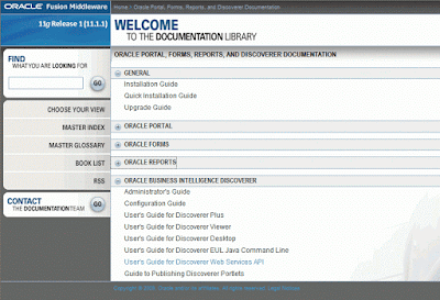
screenshot of Discoverer 11g doc page
If you see the Discoverer 11g Documentation library at http://download.oracle.com/docs/cd/E12839_01/pfrd.htm, you will notice the familiar set of docs, with one new addition. There is now a doc for the Discoverer Web Services. The "Oracle® Fusion Middleware User's Guide for Oracle Business Intelligence Discoverer Web Services API", 11g Release 1 (11.1.1), Part Number E10412-01 can be viewed at http://download.oracle.com/docs/cd/E12839_01/bi.1111/e10412/toc.htm, or downloaded as a PDF from http://download.oracle.com/docs/cd/E12839_01/bi.1111/e10412.pdf

As a brief intro, these web services are a layer of SOAP based web services that sit on top of Discoverer, provide access to a variety of functions, and provide a level of abstraction from the underlying implementation of the functionality that these services expose.

The very first instance where these web services were used was in the integration between BI Publisher and Discoverer (see my posts on this topic from 2007), that happened with the BI Publisher 10.1.3.3.0 release and Discoverer 10.1.2.2 release in 2007. Actually, there was a one-off patch that had to be applied on top of Discoverer 10.1.2.2 which contained the web services libraries. However, these web services were not yet meant to be consumed externally by customers for building their custom integrations. The intent was to document these and release them with the Discoverer 11g release. There is a slightly fascinating history behind the evolution of this project that I will try and blog about in a future post.

The other place where these web services shall be used is in the integration of Discoverer with the Oracle Business Intelligence Suite Enterprise Edition Plus, also referred to sometimes as simply OBIEE. Specifically, and since this is about functionality not yet released, please bear in mind that some or all of this could change, so do not take this as official Oracle communication, the intent is to use these Discoverer web services to publish Discoverer worksheets to an OBIEE Dashboard page, and to also use these same web services to allow OBIEE Delivers to run and send Discoverer worksheets on a scheduled basis.

More later.